- Version
- Download 20
- File Size 47.35 KB
- File Count 1
- Create Date November 29, 2024
- Last Updated December 3, 2024
Marathon Petroleum Corporation (MPC) is an Ohio-based energy company that specializes in refining, marketing, and transportation. It was established in 2011 as a spin-off from Marathon Oil, which had been in operation for over 120 years. Over time, Marathon Petroleum grew into the largest petroleum refinery operator in the United States, particularly after acquiring Andeavor in 2018. Despite its significant growth and evolution, the company has maintained a consistent and recognizable visual brand identity.
Logo History
1962 – 2011: Parent Company’s Legacy
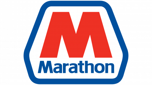
Before Marathon Petroleum became a standalone entity, it was part of Marathon Oil. The Marathon Oil logo, which was introduced in 1962, played a significant role in shaping the visual identity of Marathon Petroleum. For almost 50 years, the same logo design was used, featuring a simple yet effective representation. The logo predominantly featured a bold "M" in a slightly cooled-down shade of red, complemented by a wordmark set in a clean, simple sans-serif font. The combination of the emblem and the wordmark was placed within a blue hexagonal shape with rounded angles.
When Marathon Petroleum was formed as a subsidiary in 2011, it adopted this logo directly, with minimal changes. The design was well-suited to represent the new subsidiary, keeping the connection to its parent company clear, as both brands shared the same "Marathon" name.
2011 – 2022: Early Years of Marathon Petroleum
When Marathon Petroleum became its own entity, it kept the hexagonal emblem and the same "M" symbol, retaining the identity of the parent company. However, the design was adjusted to fit its new independent status. The red "M" symbol remained prominent, while the wordmark below it was rendered in a simple sans-serif typeface, lending a modern, straightforward look.
The hexagonal blue shape with white filling became a staple of the visual identity, with the six rounded corners giving it a distinctive and recognizable form. This logo was clean, bold, and appropriate for its time, helping the brand establish a strong presence in the energy sector.
2022 – Today: Refinement and Professionalism
In 2022, Marathon Petroleum underwent a logo redesign that refined and strengthened its visual identity. The hexagonal frame was boldened, with the blue shade deepened to a more professional, refined hue, signaling the company’s growth and maturity. The red "M" was adjusted to a more scarlet shade, giving it a fresh, vibrant appearance.
One of the most notable changes was to the "Marathon" lettering, which was now set in title case (capitalizing the first letter only). The letters were written in a classic, full-shaped sans-serif font, with traditional contours and clean cuts to give it a more contemporary feel. The combination of these elements helped solidify the brand's identity as an established and reliable corporation.
Icon and Digital Presence
Marathon Petroleum also features a simplified icon for digital platforms, which is a scaled-down version of the primary logo. However, this icon often faces the challenge of making the brand name too small to be legible, creating potential visual clutter. Despite this, the icon remains visually recognizable due to the distinct "M" emblem and the simple design.
Color Palette and Font
The color palette of blue, red, and white used in the Marathon Petroleum logo is simple yet effective. The blue symbolizes professionalism and trust, while the red invokes energy, passion, and boldness. Together, these colors echo a patriotic sentiment, reminiscent of the U.S. flag. The white background ensures the logo is clean and stands out clearly in various settings.
The sans-serif typeface used in the logo is modern and clean, which helps keep the design fresh and relevant even in today’s minimalistic design landscape. Its straight lines and lack of decorative elements make the logo timeless and professional, avoiding the pitfalls of overly trendy or outdated designs.
Conclusion
Marathon Petroleum's logo evolution is a story of consistency and refinement. The company’s visual identity has remained rooted in its heritage while adapting to modern tastes and professional standards. From its origins with Marathon Oil to its current status as a leading energy corporation, the logo has successfully maintained a sense of reliability, professionalism, and patriotism, helping it stand out in the competitive petroleum industry.
| File | Action |
|---|---|
| Marathon Petroleum Logo.png | Download |


