- Version
- Download 19
- File Size 21.40 KB
- File Count 2
- Create Date December 12, 2024
- Last Updated December 12, 2024
Avicii, the stage name of Tim Bergling, was a renowned Swedish DJ, musician, and songwriter who became a global icon in the electronic dance music (EDM) scene before his tragic passing in 2018. Known for hits like "Levels," "Wake Me Up," and "Hey Brother," his music transcended genres and garnered widespread acclaim. The logo that accompanied his identity evolved over time, yet consistently featured an interplay of the triangle-based "A" and "V," which became a signature of his brand.
Avicii Logo History
2008
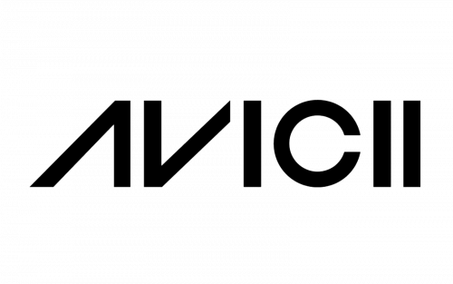
In the early stages of his career, Avicii used a simple logo that included the word "Avicii" in an all-caps sans-serif typeface. The most notable feature of this design was the "A" and "V," which were visually linked by rotating the "V" and dropping the middle bar of the "A." This design gave a sense of symmetry and fluidity, with the shapes subtly evoking the "play" button found on music devices. The repetition of the "I"s in the logo added a rhythmic, musical quality to the design, which mirrored Avicii’s connection to the music industry.
2011
By 2011, Avicii’s logo underwent a more graphic transformation, becoming the emblem most widely recognized by fans and the music industry. This version of the logo featured two white isosceles triangles on a black background. The triangles were positioned in such a way that they looked like two parts of a parallelepiped separated by a gap, forming a stylized "A" and "V." This logo not only symbolized his name but also had a deeper connection to the music world, evoking the "play" button that’s synonymous with music players and DJs.
The triangles, with their sharp geometric forms, represented the core of Avicii's brand: a clean, minimalistic, yet powerful design. It was sleek, modern, and easy to identify. While the emblem was often used alone, it was frequently paired with the word "Avicii" to further solidify the brand's recognition, especially for those unfamiliar with the DJ.
2013
In 2013, the logo was refined further. The wordmark that accompanied the logo was adjusted to match the sharpness of the emblem. The original softer, rounded corners of the "Avicii" lettering were replaced with more angular ends, better aligning with the geometric design of the triangles. The wordmark was now more dramatic, which made it more cohesive with the logo's sharp, modern aesthetic.
Font and Color
The font used in the official Avicii logo was a modern geometric sans-serif, with the most notable feature being the slanted contour of the "A" and the removal of its horizontal bar. This font gave the wordmark a bold, clean, and futuristic feel. The closest fonts to the one used in Avicii’s logo are Incompleta Regular or Widy Regular Italic, though with significant modifications to the letterforms.
As for the color palette, the Avicii logo is monochrome, predominantly using black. The simplicity of the black-and-white color scheme added to the logo’s sharpness, making it highly distinctive and visually striking. The monochromatic palette also reflected the sleek and minimalistic nature of the artist's style and music.
Legacy
Avicii's logo, with its clean lines and minimalist design, became a symbol not only of the artist’s personal brand but also of the global EDM movement. His iconic "AV" emblem, formed by two triangles, remains a lasting representation of his influence on music and culture.


