- Version
- Download 82
- File Size 129.55 KB
- File Count 1
- Create Date December 9, 2024
- Last Updated December 9, 2024
The Evolution of the Yu-Gi-Oh Logo: A Journey Through Time and Innovation
Yu-Gi-Oh, a Japanese multimedia sensation created by Kazuki Takahashi, began its journey in 1996 as a manga series blending ancient mysticism, modern gaming, and drama. Its iconic logos have evolved alongside its storytelling, marking milestones in the franchise's growth and thematic shifts.
Yu-Gi-Oh Logo Timeline
2001 – 2006
The original logo established the franchise's identity with a gothic-inspired font accented by crimson hues. The metallic sheen and bold exclamation point highlighted the energetic and competitive nature of the series, symbolizing thrilling duels and mystical adventures.
2005 – 2008
The introduction of "GX" marked a new chapter. This logo retained the red splatter background but added a golden gradient and a lightning bolt design, symbolizing vitality and the transition to a fresh narrative. The typography became sleeker, indicating a modernized and action-packed storyline.
2008 – 2011
With the "5D's" series, the logo adopted a futuristic flair. Sharp, wing-like motifs and streamlined fonts reflected the high-velocity themes of the series, such as motorcycle dueling. This design shift embodied a more adrenaline-charged narrative and cutting-edge adventures.
2011 – 2015
The "ZEXAL" logo introduced a star-shaped backdrop, emphasizing the series' interstellar themes. The bold “ZEXAL” lettering, paired with flaming "Yu-Gi-Oh" text, evoked intensity and cosmic adventure, capturing the essence of exploring uncharted dueling territories.
2015 – 2018
The "ARC-V" logo burst with energy, featuring a yellow starburst and angular typography. The focus on bold lines and vibrant colors reflected the dynamic and electrifying nature of the series, aligning with the franchise's continual evolution into more innovative storytelling.
2018 – 2021
In the "VRAINS" logo, digital aesthetics took center stage, mirroring the cyber-themed narrative. A blue digital sphere and pixelated accents symbolized virtual dueling realms, while sleek typography conveyed a futuristic and tech-driven identity.
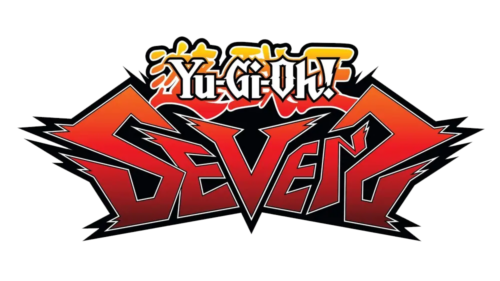
2021 – 2023
The "SEVENS" logo introduced a fiery red, angular design with jagged edges, hinting at high-energy action and rapid pacing. The sharp spikes and bold contrasts symbolized a more aggressive and intense chapter, capturing the youthful vigor and rebellious spirit of the series' direction.
Yu-Gi-Oh’s Visual Identity
Each iteration of the Yu-Gi-Oh logo reflects a distinct era in the franchise's storytelling and gameplay evolution. From its mystical roots to its cybernetic ventures, the visual journey mirrors the dynamic growth of a global phenomenon that continues to enchant fans worldwide. The logo remains a testament to the series’ enduring appeal and its ability to adapt while honoring its legacy.
| File | Action |
|---|---|
| Yu-Gi-Oh-Logo-500x281.png | Download |


