- Version
- Download 80
- File Size 92.72 KB
- File Count 1
- Create Date December 10, 2024
- Last Updated December 10, 2024
Wonder Woman, one of the most iconic female superheroes of all time, made her debut in 1941, and over the decades, her visual identity has evolved to reflect her growth as a character. From her initial Art Deco-inspired logo to the more streamlined and powerful designs of today, the Wonder Woman logo has continuously evolved, symbolizing her strength, power, and grace.
Logo History:
- 1941 – 1942: The first Wonder Woman logo featured a smooth, elegant design with a gold-yellow bird, drawn in an Art Deco style. The bird's wings were raised, and its contours were arched, with black accent lines for additional detail. This early emblem exuded grace and elegance.
- 1942 – 1949: The bird was refined with more attention to detail. The wings grew larger, and additional lines accentuated the feathers, though the color palette remained the same.
- 1949 – 1959: This version introduced more abstract elements. The bird’s wings were reshaped with rounded, arched elements, reminiscent of butterfly wings. The design became more unique, yet retained the same color scheme.
- 1959 – 1968: The bird's design transformed into a more fantastical style. The shape of the emblem now resembled a trophy, with wings resembling ancient fans. The colors stayed consistent with previous iterations.
- 1972 – 1981: The bird evolved into a figure of a woman, with the circular wings becoming stylized arms spread outwards. The bottom of the figure flared, evoking the look of an elegant gown. This version represented a shift toward a more feminine and dynamic design.
- 1981 – Today: The most iconic version of the Wonder Woman logo debuted in 1981 and remains in use today. It consists of two interlocking "W"s, with their bars extended outwards. The emblem is typically rendered in a color palette of black, white, and yellow, symbolizing strength and power.
- 1994: A refinement of the iconic WW badge was introduced in 1994, with elongated and arched wings. The color palette remained yellow and black, but the design was more streamlined.
- 1995 – 1998: This version featured a stronger and more geometric look, with triangular wings and a solid yellow triangle supporting the badge. The design reflected Wonder Woman’s power and balance.
- 1998 – 2006: The logo underwent another redesign with a smooth copper-to-beige color palette, which gave the emblem a more refined and elegant feel while maintaining the same core design elements.
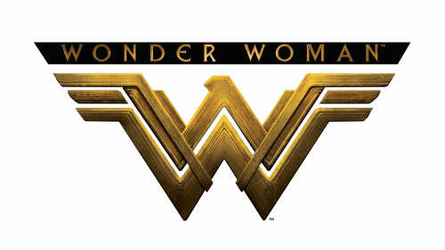
- 2006 – 2011, 2016 – Today: The 2006 redesign returned to the classic red and yellow color scheme, though with a darker, more intense red. The double-W symbol was enhanced with the addition of a bird's head, adding strength and modernity to the look. The 2016 version took this design further with a 3D, dark gold execution, giving the emblem a more powerful and refined look.
- 2011 – 2016: The logo used during this period was a light-gold emblem with sharpened angles and slightly arched wings. While the design retained feminine qualities, it also exuded strength and a sense of danger.
Font and Colors:
The distinctive "W" in Wonder Woman’s logo was custom-designed and doesn’t belong to any existing typefaces. The character’s colors, inspired by the American flag, have often featured red, blue, and white, with gold being a recurring color in the emblem. Gold reflects the heroine's divine and powerful nature, while red and blue emphasize her patriotism and strong, heroic qualities.
| File | Action |
|---|---|
| Wonder Woman Logo.png | Download |


