- Version
- Download 49
- File Size 13.69 KB
- File Count 1
- Create Date December 1, 2024
- Last Updated December 1, 2024
WeWork, a globally recognized provider of coworking spaces, has recently undergone a subtle yet significant rebranding, signaling a refined approach to its visual identity. The redesign, led by the New York-based design studio Franklyn, emphasizes the company's commitment to growth while preserving its established image.
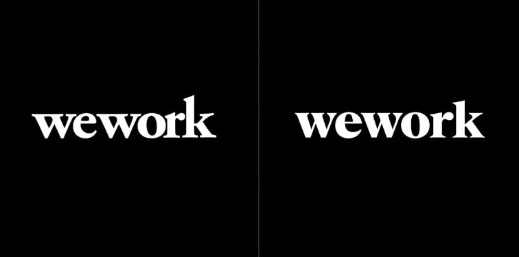
The most noticeable change is the shift to a black-and-white logo, which replaces the previous multicolored design. This minimalist approach aims to create a more consistent and adaptable brand presence across various contexts, whether digital applications or physical signage. The black-and-white logo ensures a clean and professional appearance, helping WeWork maintain a timeless and unified identity.
A key feature of the redesign is the refinement of the logo's kerning, which has been adjusted to improve legibility and visual harmony. The serifs in the letter "w" are now separated, creating a more streamlined and elegant appearance. This subtle alteration enhances the aesthetics of the logo, making it easier to distinguish and ensuring the old and new versions of the logo can coexist seamlessly. WeWork intends to gradually phase in the updated logo, using both iterations simultaneously for some time.
In addition to the logo changes, Franklyn introduced a new color palette that complements the black-and-white logo. These colors provide the brand with greater flexibility in visual communication, helping to diversify the brand’s overall look while remaining cohesive. The rebranding also includes the introduction of hand-drawn illustrations depicting people and workspaces, which adds a personal and human touch to the brand's visuals. This shift from the previous photo-based style aims to convey warmth and approachability, further enhancing WeWork's identity.
The new typography is another key element of the rebrand. Franklyn created a custom typeface, WeWork Serif, an evolved version of the company’s previous font, offering a more refined and professional look. To complement this, the body text will use Aperçu Pro, a modern and clean font that ensures readability and consistency across all brand materials.
This rebranding effort demonstrates WeWork's dedication to evolving its image while maintaining continuity with its original identity, offering a more polished and cohesive visual experience across all platforms.
| File | Action |
|---|---|
| WeWork new logo.jpg | Download |


