- Version
- Download 103
- File Size 128.56 KB
- File Count 1
- Create Date November 18, 2024
- Last Updated November 18, 2024
The Super Mario franchise, created by Shigeru Miyamoto and published by Nintendo, has captured the imagination of gamers since its debut in 1985 with Super Mario Bros. Over the decades, the franchise's logo has undergone significant transformations to reflect its evolving identity, playful spirit, and vibrant appeal.
1985: The Beginning (Super Mario Bros.)
The original Super Mario Bros. featured a straightforward logo on its game cover. The title was written in a simple sans-serif typeface, with the words “Mario Bros.” in a large, bold style and “Super” in a smaller size above it. The red color provided contrast against the black background, ensuring legibility while conveying energy. However, this design was minimalistic and lacked the iconic character seen in later iterations.
By 2006, with the release of New Super Mario Bros., the logo took on a more refined look. The letters became plumper and rounded, incorporating elements inspired by the game’s design. A touch of black shading added depth, signaling the franchise’s progression toward a more dynamic visual identity.
1996: The First Iconic Logo
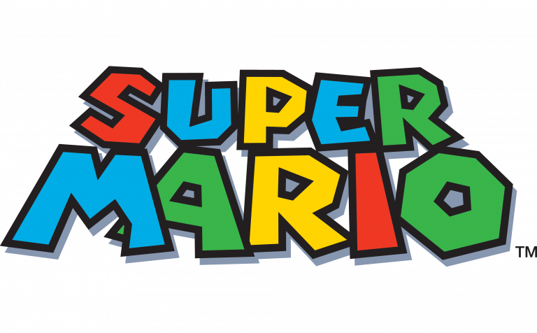
The launch of Super Mario 64 marked the debut of what can be considered the first true Super Mario logo, which would serve as the foundation for the franchise’s branding. This playful and vibrant design featured:
- Casual, colorful letters: Each glyph was unique, with quirky details such as a cut-out “M” leg and a hexagonal “O.”
- Bright palette: A mix of red, blue, yellow, and green, symbolizing the fun and variety of the Mario universe.
- Black outlines and light shading: These gave the logo dimension and made the colors pop.
This style persisted through games like Super Mario Galaxy 2 (2010), solidifying its place in the franchise’s identity.
2011: A Modern Update
With the release of Super Mario 3D Land, the logo received a subtle yet impactful refresh:
- Plumper, more uniform letters: While retaining its playful vibe, the letters became slightly straighter, and the "M" lost its cut-out detail.
- Stronger black shading: The shadows were darker and filled more space, creating a bold and cohesive look.
- Refined color distribution: The palette of red, blue, yellow, and green remained, but the letter-color assignments shifted (e.g., the "S" became blue, and the "M" turned red).
- Tighter spacing: Letters overlapped slightly, emphasizing the franchise's dynamic and energetic tone.
Key Features of the Super Mario Logo
The Super Mario logo embodies the series’ core values of fun, creativity, and adventure. Its colorful and quirky letters reflect the whimsical world of Mario, while the bold outlines and shading give it a sense of depth and energy. The evolving design mirrors the franchise’s growth, balancing nostalgia with modernity.
The Super Mario logo has become an enduring symbol of the beloved gaming franchise, instantly recognizable to players of all generations.
| File | Action |
|---|---|
| Super-Mario-logo-768x476.png | Download |


