- Version
- Download 55
- File Size 35.55 KB
- File Count 1
- Create Date December 13, 2024
- Last Updated December 13, 2024
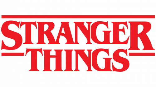
The Stranger Things logo is an integral part of the show's identity, serving as both a visual representation of its nostalgic 1980s influences and a symbol of its supernatural, suspenseful narrative. Launched alongside the show in 2016, the logo has undergone subtle changes over time, but it has maintained its core design elements, helping to solidify the series as a cultural phenomenon.
Meaning and History of the Stranger Things Logo
The Stranger Things logo was designed with the intention of invoking the feeling of classic 1980s horror, particularly drawing from the work of Stephen King, whose books heavily influenced the series. The show's creators, the Duffer brothers, aimed to create a visual style reminiscent of the vintage book covers of King’s novels, specifically books like It and The Shining, as well as the title sequences of iconic films like Alien.
The initial design for the logo was inspired by the ITC Benguiat font, a decorative serif type created in 1977 by New York typographer Ed Benguiat. This font was chosen for its distinct, vintage appeal, evoking a sense of mystery and tension. The Duffer brothers wanted the logo to resemble the covers of 1970s and 1980s horror books and music albums, and they even provided the design studio Imaginary Forces with 15 Stephen King novels to capture the right tone.
Logo Design Evolution
The Stranger Things logo has remained relatively consistent, with the most significant changes occurring in the addition of the season numbers. Here's a look at how the logo evolved with each season:
- 2016 (Season 1): The original logo featured bold, uppercase lettering in a strongly contoured serif typeface. The text was red with neon-like edges, giving it a retro, glowing effect. This logo included several horizontal lines across the top and sides, with a particular emphasis on the letters "S" and "R."
- 2017 (Season 2): For the second season, the logo retained the same style, but the lettering was given a gradient effect, transitioning from orange to red. The number "2" was added in a bold dark red-to-black gradient, enhancing the dramatic feel of the logo.
- 2019 (Season 3): The third season saw a slight change in the logo's appearance, with the lettering turning black and outlined in red. The numeral "3" appeared in a similar gradient style, adding to the series' overall visual consistency.
- 2021 (Season 4): The fourth season introduced another modification to the logo, with the lettering now having a transparent gray shade. The number "4" was incorporated in a more elegant, curved design with sharp angles, and its color palette was a darker version of the previous season's red-to-black gradient.
Font Customization and Symbolism
The primary font used in the Stranger Things logo is the ITC Benguiat font, which was inspired by Art Nouveau typography. While the font is decorative and legible, the Duffer brothers worked closely with Imaginary Forces to customize it specifically for the show's visual identity. Notable modifications to the original font include changes to the "S" and "T," as well as alterations to the "G" and "E" to make the letters more compact and stylistically consistent.
The red gradient used on the logo, often set against a black background, has a dual purpose. It evokes the neon lights of old-fashioned motels, while also reflecting the eerie, mysterious, and dangerous atmosphere of the show. The red is not a symbol of romance or passion but of tension, foreboding, and the supernatural forces at play in Hawkins, Indiana.
Impact of the Logo
The Stranger Things logo is iconic not just because of its visual design but also because it encapsulates the spirit of the show. It combines nostalgia for 1980s pop culture with a dark, supernatural twist, making it instantly recognizable to fans worldwide. The logo, in its evolving forms, reinforces the series' narrative and tone, drawing viewers into the mysterious world of Hawkins and the horrors that lie beyond the "Upside Down."
The use of a custom, vintage-inspired font paired with bold, dramatic colors creates a visual identity that perfectly complements the show’s themes of friendship, adventure, and the supernatural. The Stranger Things logo has become a lasting symbol of modern pop culture, representing the era of 80s nostalgia while also resonating with contemporary audiences.
| File | Action |
|---|---|
| Stranger Things Logo.png | Download |


