- Version
- Download 98
- File Size 123.15 KB
- File Count 1
- Create Date December 6, 2024
- Last Updated December 6, 2024
The Poland National Football Team, managed by the Polish Football Association (PZPN), represents Poland in international football competitions, including major tournaments like the FIFA World Cup and the UEFA European Championship. The team's logo has evolved significantly since its inception in 1919, reflecting Poland’s rich football history and national identity.
Logo Evolution: A Journey Through Design
1924 – 1929: The first official logo featured a white eagle with outstretched wings, set against a red shield. This symbol, representing Poland’s national pride, was simple but powerful, emphasizing the strength and resilience of the nation.
1930 – 1950: The eagle became more stylized, with intricate detailing on its feathers, crown, and talons. The shield was outlined in gold, adding a touch of elegance and symbolizing Poland's growing international presence.
1950 – 1974: During this period, the eagle’s design was simplified for better recognition, reflecting the post-war era's focus on clarity. The streamlined design, combined with a bold and aggressive eagle posture, represented Poland’s resilience and strength.
1974 – 1989: The eagle was depicted in more detail, with naturalistic features and a golden crown. This version symbolized Poland’s aspirations for international excellence, with enhanced realism and sophistication in the design.
1992 – 1993: The addition of the “PZPN” acronym beneath the eagle, along with a golden background and a football at the bottom, emphasized the team's identity and its connection to the sport. The golden eagle signified prestige and success.
1993 – 2005: This design returned to a traditional white eagle but featured modernized elements. The sharp lines and symmetrical wings gave the emblem a balanced, authoritative look.
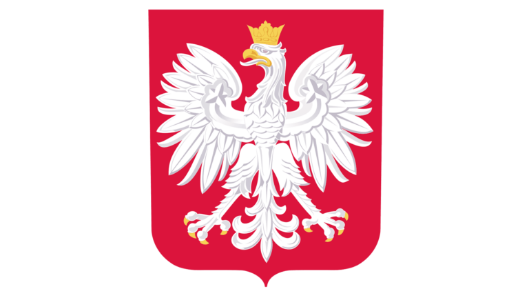
2006 – Present: The current logo combines modern sophistication with traditional elements. The white eagle, depicted with sharp lines and golden accents, is set against a red shield. The word “POLSKA” above the eagle emphasizes national pride, representing the team’s blend of heritage and ambition in the global football landscape.
The Poland National Football Team’s logo has evolved from simple, traditional symbols to more modern, sophisticated designs, reflecting both the country’s football history and its current standing in international sports. The eagle, a constant in all versions, serves as a symbol of national pride, strength, and determination, while the design’s evolution mirrors Poland's football growth and global aspirations.
| File | Action |
|---|---|
| Poland-National-Football-Team-Logo-768x432.png | Download |


