- Version
- Download 7
- File Size 70.36 KB
- File Count 1
- Create Date November 18, 2024
- Last Updated November 18, 2024
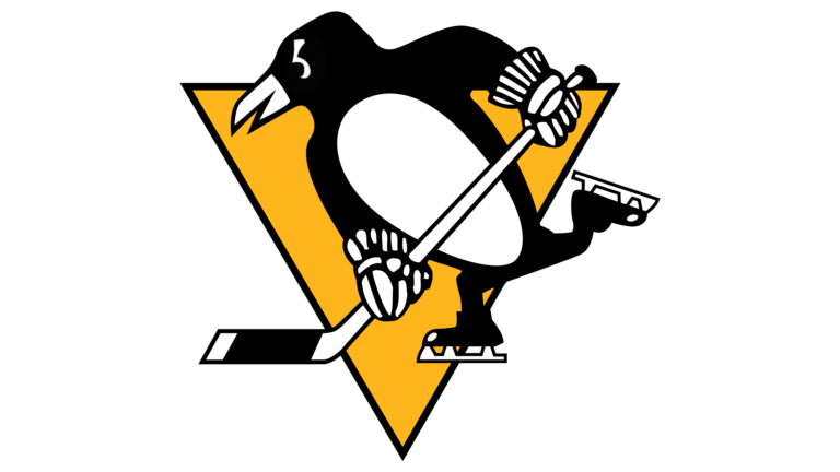
The Pittsburgh Penguins, one of the most successful and iconic teams in the National Hockey League (NHL), is known not only for its championship wins but also for its distinctive and evolving logo. The team, which was established in 1967, has maintained a logo built around a key visual symbol: the skating penguin. While the logo has undergone several design revisions over the years, the gold triangle has been a consistent feature, symbolizing the Golden Triangle of Pittsburgh's downtown area.
Logo History
1967 — 1968: The very first Pittsburgh Penguins logo was introduced in 1967 and served as a strong foundation for the team’s visual identity. It consisted of:
- A yellow triangle, pointing downward, representing Pittsburgh's Golden Triangle.
- A white-and-black penguin in ice skates, holding a hockey stick.
- A waving scarf, which added movement and character to the design.
- The emblem was encircled with a double circle frame and a blue wordmark surrounding the logo.
The design was both simple and meaningful, incorporating elements that spoke to the team's roots and the sport itself.
1969 — 1971: A revision in 1969 saw the skating penguin redesigned. The contours were made more geometric and modern, while the scarf was removed. The blue circle frame became more prominent, and the white wordmark was placed around the logo’s perimeter.
1972 — 1992: In 1972, the team opted for a more minimalist approach:
- The round frame was removed, and the penguin was placed directly on the yellow triangle.
- This updated logo was cleaner and stronger, emphasizing the penguin and its connection to the team’s identity.
1993 — 2002: After winning two Stanley Cups, the Penguins decided to refresh their logo in 1993. Designed by Vance Wright Adams and Associates, the new logo kept the yellow triangle but featured the penguin’s head emerging from the triangle, facing left. Key features included:
- Elongated beak and sharp angles for a sleek look.
- A black triangle at the upper right, resembling a penguin’s wing.
- Geometric white lines added to the triangle, contributing to a modern and dynamic design.
This version remained in use for almost a decade, encapsulating the team’s competitive spirit.
2003 — 2016: The Penguins returned to their 1972 design in 2003, but with a change in color:
- The yellow became a lighter shade, closer to beige, while still retaining the iconic black-and-white scheme.
- The penguin itself was slightly refined, but the overall look stayed true to its origins.
2017 — Present: In 2017, the team revisited its original intense color palette:
- The bright yellow was reintroduced, providing a vibrant and energetic appearance on team uniforms and merchandise.
- The overall design remained largely the same as the 2003 iteration, but the updated color palette gave it a refreshed and eye-catching appearance.
This final version of the logo celebrates the team’s legacy while bringing forward its dynamic presence in the modern era.
Font and Wordmark
The current wordmark (adopted in 2017) is based on a custom typeface. It features the word “Pittsburgh” in black at the top, and “Penguins” in a combination of black and gold placed beneath it. This wordmark retains elements from previous versions but with a subtle color shift.
Color Palette
The Pittsburgh Penguins logo uses the following colors:
- Black: PANTONE BLACK C, HEX #000000
- Gold: PANTONE 4535 C, HEX #CFC493
- Yellow: PANTONE 1235 C, HEX #FCB514
- White: HEX #FFFFFF
This color scheme evokes energy, professionalism, and a strong connection to the city’s roots.
| File | Action |
|---|---|
| Pittsburgh-Penguins-Logo-768x432.png | Download |


