- Version
- Download 86
- File Size 43.42 KB
- File Count 1
- Create Date December 6, 2024
- Last Updated December 6, 2024
Founded in 1950 and based in Lyon, Olympique Lyonnais is one of France's most successful football clubs. Nicknamed “Les Gones” (The Kids), the team’s identity is rooted in heritage, patriotism, and innovation. Its visual identity, anchored by heraldic principles, has evolved through time to reflect the club’s rich history and modern ambitions.
Early Designs: 1950–1980
1950–1957
The club's inaugural logo featured a shield divided into a white upper section and a red lower section.
The white area housed the initials "O" and "L" in blue.
The red section displayed a rampant lion in white, a heraldic symbol of strength.
1957–1965
This iteration introduced a purple hue in place of blue and subtly adjusted the lion's pose, modernizing the design while maintaining the core elements.
1965–1974
Gold accents replaced the blue outlines, giving the logo a regal touch. The lion adopted a light blue outline, while the overall palette gained richer tones for a more polished appearance.
1974–1976
The shield's interior saw significant changes:
The left section turned solid red, featuring white initials and a newly added soccer ball.
Stripes of blue and white adorned the right section, while the lion was now orange.
1976–1977
Simplifying the design, this version removed the shield and ball, focusing solely on the white-outlined initials and a red lion.
1977–1980
This bold redesign featured a red lion outlined in gold, standing on a black-and-white football. A stylized gold key, formed by intertwined "O" and "L," added a unique heraldic element.
Modernization and Minimalism: 1980–1996
1980–1989
The club embraced cleaner lines and a contemporary aesthetic.
The lion and football remained but lacked outlines, transitioning to a smoother design.
The football featured purple accents, while the key turned bold and solid.
1989–1996
A minimalist logo celebrated national pride with a geometric "OL" design.
The initials had a white fill with thick black outlines.
A French flag chevron adorned the letters, symbolizing patriotism and elegance.
Return to Tradition: 1996–2006
1996–2000
The lion rampant returned, integrated into a redesigned crest.
The gold lion was positioned within a white "O" and blue shield.
A bold red rectangle across the top featured a gold-outlined nameplate, emphasizing the club's heritage.
2000–2006
This version retained the 1996 design but made the lettering bolder for improved visibility.
Refinement and Global Status: 2006–Today
2006–2022
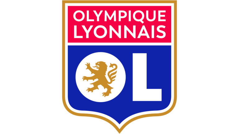
A pivotal redesign solidified Olympique Lyonnais as a global football powerhouse:
The crest was split into dark blue and red sections, outlined in gold.
The initials "OL" were prominently displayed in white block letters.
A modernized gold lion remained central, symbolizing strength and pride.
2022–Present
The latest logo introduced a brighter and cleaner look:
The red and blue hues became more vivid, while the gold outline around the initials was removed.
A white line complemented the remaining gold border on the shield’s edge, creating a contemporary and balanced design.
Colors of Olympique Lyonnais
The club’s official color palette reflects its identity and the French tricolor:
Red: HEX #DA0812, symbolizing passion and energy.
Blue: HEX #14387F, representing loyalty and tradition.
White: HEX #FFFFFF, standing for purity and unity.
Gold: HEX #D29D46, adding a touch of elegance and prestige.
The evolution of Olympique Lyonnais' logo tells a story of tradition, innovation, and patriotism. From its early heraldic crests to its modern, streamlined designs, the emblem has consistently celebrated the club's legacy while adapting to contemporary trends. This fusion of history and modernity cements its place as an iconic symbol in French football.
| File | Action |
|---|---|
| Olympique-Lyonnais-logo-768x432.png | Download |


