- Version
- Download 44
- File Size 44.56 KB
- File Count 1
- Create Date December 9, 2024
- Last Updated December 9, 2024
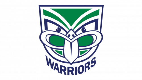
The New Zealand Warriors have a distinct and culturally rich logo that stands out in the National Rugby League. Drawing inspiration from Māori heritage, the emblem showcases a carved idol's face, known as a "tekoteko," blending tradition with modern sports branding.
New Zealand Warriors - Meaning and Evolution of Logos
Core Identity
The New Zealand Warriors, established in 1995, have quickly become a notable rugby club in the NRL. Based in Auckland, the team pays homage to its cultural roots with a logo that symbolizes strength, identity, and resilience, represented through its intricate and meaningful design.
Timeline of Logo Designs
1995–1999: The Original Tekoteko
The inaugural logo, created by Francis Allan of Colenso, prominently featured the tekoteko face. This Māori carving symbolizes guardianship and protection, reflecting the club’s values. The team’s original name, "Auckland Warriors," was incorporated, grounding the club in its home city.
2000–2001: Cultural Refinement
After the Tainui tribe and ex-Kiwi coach Graham Lowe took over, the emblem underwent a subtle modification. The tiki’s tongue, initially curved (a symbol of a curse in Māori culture), was straightened to better align with cultural respect and symbolism.
2002–2020: Bold and Modern Aesthetic
A major redesign in 2002 saw the introduction of a black and silver color scheme, replacing the original blue, green, and white palette. This sleek and modern look highlighted the club’s fierce and competitive spirit, with the tekoteko remaining central to the design.
2019: Celebratory Variation
For its 25th season, the Warriors unveiled a split-color logo. One half featured the original vibrant palette of blue, green, and white, while the other half retained the black and silver scheme. This design celebrated the club's evolution while honoring its origins.
2020–Present: Simplified Strength
The latest iteration of the logo keeps the tekoteko mask intact with its bright green, blue, and white colors. However, the typography was updated: the “Warriors” wordmark beneath the badge now uses a clean, bold sans-serif font, exuding strength and clarity.
Colors and Symbolism
The Warriors’ color palette has evolved over the years, reflecting different phases of the club’s journey. Initially, blue, white, red, and green represented the team's vibrancy and connection to its heritage. In 2002, the shift to black and silver aligned with a more aggressive and modern branding style. Today, the return to green, blue, and white emphasizes tradition while maintaining a contemporary edge.
New Zealand Warriors Today
Rooted in Auckland with home arenas at Mount Smart Stadium and Moreton Daily Stadium, the Warriors remain a symbol of perseverance and cultural pride in the NRL. With a visually striking logo that bridges heritage and modernity, the team continues to captivate fans and honor its Māori influence.
| File | Action |
|---|---|
| New-Zealand-Warriors-logo-500x281.png | Download |


