- Version
- Download 78
- File Size 149.66 KB
- File Count 1
- Create Date December 13, 2024
- Last Updated December 13, 2024
Metro-Goldwyn-Mayer (MGM) is one of the most iconic names in Hollywood and the film industry, founded in 1924 through the merger of Metro Pictures, Goldwyn Pictures, and Louis B. Mayer Pictures. The company became synonymous with grand cinematic productions, and its roaring lion logo is an enduring symbol of Hollywood’s golden age.
MGM Logo History
The MGM logo has evolved significantly over the years, reflecting the changing times and the company’s transformation, but the roaring lion has remained at its core.
1924 – 1964
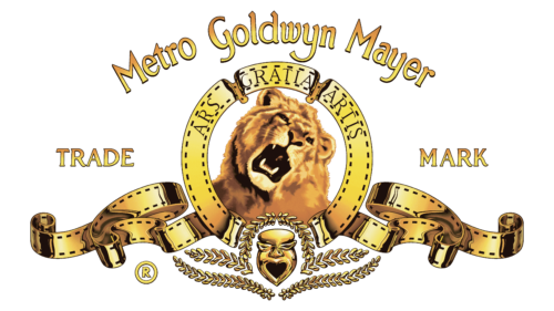
The first MGM logo was introduced in the mid-1920s, combining a logotype and an ornate emblem. The logotype featured "Metro," "Goldwyn," and "Mayer" in distinct fonts, with "Metro" and "Mayer" in Art Deco serif, and "Goldwyn" in elegant cursive. The emblem featured the iconic lion's head within a circular frame, accompanied by the motto "Ars Gratia Artis" (Art for Art’s Sake). This version was widely used on company products and posters.
In 1924, the company also introduced a design with a lion silhouette within a banner frame, adding to the logo's grandeur. By 1939, a more refined emblem featured two ribbons curving downward from a ring around the lion’s head, accompanied by laurel wreaths.
1964 – 1982
In the 1960s, MGM simplified the logo with a black circular frame around the lion's head and two ribbons flowing from the bottom. This version remained until 1966 when the company adopted a more modern look. The lion’s image was now in bold black and white, with the letters “MGM” placed underneath in a simple sans-serif typeface.
By 1982, the logo evolved once again, with a roaring lion and a new two-level wordmark, “MGM/UA” and “Entertainment Co.” The ribbons from earlier designs were reintroduced, giving the logo a sense of vintage sophistication.
1984 – 2021
During the 1980s and early 1990s, several variations of the logo were used, sometimes removing the wordmark and other times incorporating it into the design. Notable changes included more intricate ribbonwork and a black-and-white mask placed under the lion's portrait. By 1992, the logo was cleaned up, with more distinct contours around the lion’s face, and the ribbons became more defined.
The version used from 2011 to 2021 refined this further, using the same 1992 design but with a larger, bolder "MGM" wordmark. The font became more classic, with a Garamond-like serif typeface.
2021 – Present
In 2021, MGM unveiled a refreshed logo with a more modern, three-dimensional look. The gold and black color scheme was emphasized, adding a metallic sheen to the lion's head and ribbons, making the logo appear even more vibrant and dynamic.
Symbolism and Color
The central element of the MGM logo is the lion’s head, symbolizing power, excellence, and timeless beauty. The lion is framed by a circular ribbon, evoking both grandeur and tradition. The gold color in the logo reflects the natural fur color of the lion, while also suggesting the premium quality of the studio’s productions. The matte gold color complements the strength and prestige of the brand.
Font
The font used in the MGM wordmark is simple and unassuming, ensuring that the viewer’s attention remains focused on the lion and the emblem. The typeface used is similar to classic serif fonts like Garamond and Poliphili, contributing to the logo's classic yet enduring style.
The MGM logo remains one of the most recognizable symbols in the entertainment industry, representing a legacy of cinematic excellence, creativity, and artistry.
| File | Action |
|---|---|
| MGM Logo.png | Download |


