- Version
- Download 56
- File Size 27.33 KB
- File Count 1
- Create Date December 13, 2024
- Last Updated December 13, 2024
The Maryland Terrapins logo has undergone a remarkable evolution, shifting from a cluttered, cartoonish design to a sleek and minimalist emblem. This transformation mirrors the team's growth and aspirations in collegiate sports, reflecting both their legacy and contemporary identity.
The Legacy of the Maryland Terrapins
The Maryland Terrapins represent the athletic teams of the University of Maryland, College Park, with a rich history that traces back to the university’s founding in 1856. Over the years, the "Terps" have made significant contributions to collegiate sports, particularly excelling in basketball, football, and lacrosse. The men’s basketball team achieved national prominence with an NCAA Championship in 2002, while the women’s lacrosse team has dominated the sport with multiple national titles. The university's continued success, bolstered by its move to the Big Ten Conference in 2014, ensures that the Terrapins remain a powerful force in collegiate athletics.
The Maryland Terrapins Logo Timeline
- 1967 – 1970
The first logo introduced in 1967 depicted a hand-drawn, black-and-white turtle in motion, representing speed and energy. This emblem had no accompanying text and set the foundation for future designs. - 1970 – 1983
A more defined version of the logo appeared in 1970. This logo featured a red, black, and white turtle standing on its rear legs, with a prominent "M" to the right. The design exuded strength and dynamism. - 1983 – 1988
The 1983 logo introduced a modernized, bold “M” formed by horizontal red lines of varying lengths and thicknesses, accompanied by the word “Maryland” underneath. This design aimed to symbolize the team's power and commitment to excellence. - 1988 – 1996
By 1988, the turtle returned in a slightly altered form, holding a flag with a unique checkered pattern. The new logo incorporated the “Maryland Terrapins” name in a geometric serif font, creating a more sophisticated and dynamic image. - 1996 – 2005
The 1996 update introduced a more stylized turtle, which appeared lighter and more athletic, reinforcing the logo's connection to the team’s evolving identity. The new look communicated the team’s energetic and competitive nature. - 2005 – 2006
In 2005, the turtle grew in size, but the team name was dropped. The focus shifted entirely to the turtle as a central symbol, reinforcing the mascot's significance. - 2006 – 2012
The 2006 redesign made minor tweaks to the original concept, with darker colors and a more menacing look for the turtle. This version conveyed a stronger, more serious brand identity. - 2012 – Present
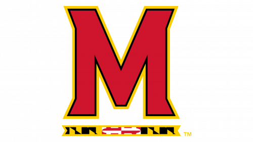
By 2012, the logo simplified significantly. The turtle was removed entirely, leaving only the bold “M” with a subtle underline, creating a clean and modern logo that aligns with the current era of Maryland athletics.
Maryland Terrapins Basketball and Uniform Design
The Maryland Terrapins basketball team, with a history of NCAA tournament appearances and a championship win in 2002, maintains a minimalist and visually striking uniform style. Their home, away, and alternate basketball uniforms focus on bold colors—red, white, and black—while emphasizing simplicity for easy recognition.
The football and soccer teams adopt a similar approach, utilizing clean lines and strong color contrasts. Football uniforms feature red and white jerseys, with optional black designs, while soccer jerseys focus on solid red or white with subtle details.
Maryland Terrapins Football Helmet Designs
The Terrapins’ helmets have undergone several design variations over the years. The white helmet features red stripes with a bold "Terps" logo, while the red helmet has a more geometric grille and simplified stripes. Both designs are iconic representations of Maryland’s dynamic sports culture.
Stadiums and Facilities
The Maryland Terrapins compete in world-class facilities that support their athletic programs across 14 sports disciplines. SECU Stadium, home to football and lacrosse, has been a staple since 1950. The XFINITY Center, with its capacity of 18,000, hosts basketball and volleyball events, while Ludwig Field serves as the venue for soccer. These stadiums provide the Terrapins with the infrastructure to compete at the highest levels.
Maryland Terrapins Team Colors
The official team colors reflect the energy and boldness of the Maryland Terrapins:
- Red: #E03A3E
- Gold: #FFD520
- Black: #000000
- White: #FFFFFF
These colors are consistently applied across uniforms, logos, and merchandise, solidifying the Terrapins' visual identity.
Through the evolution of its logo and uniform designs, the Maryland Terrapins have embraced a minimalist aesthetic that mirrors their competitive spirit, while remaining grounded in tradition. As the university's athletic teams continue to thrive, their iconic logo stands as a testament to their enduring legacy in collegiate sports.
| File | Action |
|---|---|
| Maryland Terrapins Logo.png | Download |


