- Version
- Download 101
- File Size 23.71 KB
- File Count 1
- Create Date December 14, 2024
- Last Updated December 14, 2024
Klasky Csupo, Inc. is a Los Angeles-based animation studio and production company established in 1982. The company emerged from the partnership between producer Arlene Klasky and animators Gábor and Attila Csupó. Among its many projects, the Nickelodeon series Rugrats is widely regarded as its most iconic creation.
The Klasky Csupo logo has undergone multiple iterations, yet its fundamental design has remained consistent, reflecting the company's commitment to preserving its recognizable visual identity. Over the years, five primary versions of the logo have been introduced, each maintaining a connection to the original aesthetic while incorporating subtle updates.
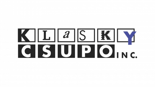
The earliest logo, used between 1981 and 1999 (and briefly revived in the 2000s and 2010s), featured a set of double-line boxes resembling a filmstrip. Each box housed a letter from the company's name, evoking the creative and cinematic nature of its work. A standout detail was the violet-colored "Y" in the word "Klasky," which contrasted with the otherwise monochromatic design, making it visually distinct and adding a playful flair. The uneven, vintage-style lettering reinforced the logo's connection to filmmaking and animation.
In 1991, an updated version debuted during Rugrats and was used sporadically until 2021. This iteration improved legibility, particularly for the word "Klasky," which was previously difficult to decipher at first glance. While the design sacrificed some of the original's quirky, film-like characteristics, it made the company name easier to recognize. The word "Csupo" also adopted a more formal appearance, and the accompanying "INC." was bolded for clarity. Despite these adjustments, this version retained ties to the company's artistic roots.
The logo underwent another revision in 2003, which became more prominent from 2008 onward. In this version, the word "Klasky" adopted a bolder typeface and a slightly more playful tone, which complemented its neighboring "Csupo." The removal of "INC." streamlined the design, giving it a cleaner and more modern look. While the logo still hinted at a connection to film and animation, its legibility remained somewhat compromised, emphasizing the brand's quirky, unconventional spirit.
Across its history, the Klasky Csupo logo has consistently reflected the company's creativity and artistic essence, balancing nostalgia with modern updates to remain relevant in the evolving entertainment industry.
| File | Action |
|---|---|
| Klasky Csupo Logo.png | Download |


