- Version
- Download 44
- File Size 29.21 KB
- File Count 1
- Create Date December 3, 2024
- Last Updated December 3, 2024
Founded in 1969 in Alabama, KinderCare has grown to become a prominent chain of educational centers, with over 1,500 locations across the United States, serving more than 200,000 children. The company specializes in early childhood education for kids aged 6 to 12 and is committed to providing nurturing environments where young learners can thrive.
Early Logo
The original KinderCare logo was relatively simple and featured hand-drawn illustrations. The design used an orange color scheme with bold black outlines, giving it a friendly, approachable feel. Below the primary wordmark, "Learning Centers" was included, emphasizing the company's educational focus.
2021-Present Logo
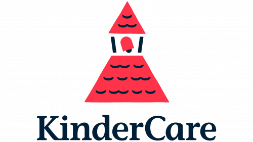
The modern KinderCare logo, introduced in 2021, maintains a warm and caring tone while adopting a more polished and contemporary design. The logo features a combination of red, white, and black elements that convey both professionalism and a sense of nurturing. The red symbolizes love and care, while black and white add a touch of reliability and sophistication.
Visual Elements
- Emblem: The emblem showcases a house with a red tile roof, symbolizing warmth, coziness, and a caring atmosphere. This reflects the company’s emphasis on fostering an environment of love and friendship, particularly for children.
- Wordmark: The wordmark is set in a bold serif typeface, similar to ITC Stone Informal Pro SemiBold, with smooth rounded elements and distinct serifs. This typeface choice evokes a sense of trustworthiness while maintaining a friendly, welcoming vibe.
- Tagline: The tagline "Learning Centers" is placed below the main wordmark in all capital letters, providing additional clarity on the company’s focus.
Font and Color Palette
The logo’s serif font exudes confidence while maintaining a gentle, tender character in its curves and sharp edges. The color scheme, predominantly red, is complemented by black and white for a balanced, professional yet caring visual identity.
- Red symbolizes warmth and care.
- Black and White enhance the sense of reliability and professionalism, ensuring the logo feels both approachable and competent.
In sum, the KinderCare logo communicates a blend of nurturing care for children and professional reliability, reflecting the company’s mission to provide high-quality education in a warm, welcoming environment.
| File | Action |
|---|---|
| KinderCare Logo.png | Download |


