- Version
- Download 63
- File Size 31.79 KB
- File Count 1
- Create Date November 28, 2024
- Last Updated November 30, 2024
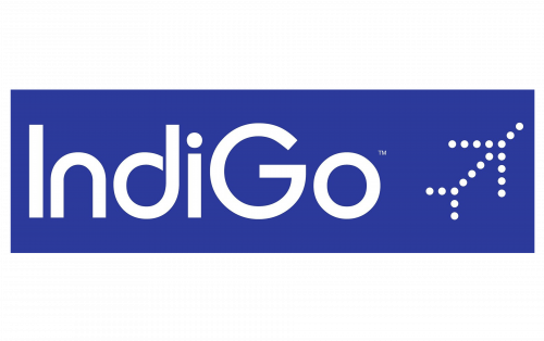
IndiGo, one of India's largest low-cost airlines, is known for its straightforward and symbolic logo design that reflects both the airline's industry and the meaning behind its name. Established in 2006, IndiGo quickly became the largest carrier in India by fleet size and passenger numbers, with a presence in over 85 destinations.
Logo Design
The IndiGo logo features a square box that houses both the symbol and the wordmark. The design is simple yet rich in meaning:
Symbol
The upper right-hand corner of the logo features a stylized aircraft represented by a series of white dots. The aircraft is pointed upwards and to the right, symbolizing takeoff and forward motion. This motion, directed toward the top right, conveys optimism, growth, and a bright future, aligning well with the airline's brand message of dynamic progress.
Wordmark
The wordmark "IndiGo" is placed close to the lower border of the square box. The customized font tries to evoke dynamism through unusual shapes in the letters:
- The “d” has a loop shape,
- The “n” is designed with an upside-down U-turn,
- The “g” and “o” resemble a roundabout or traffic circle.
These design elements give the wordmark a sense of motion. However, the letters don't perfectly blend, which creates an awkwardness when read together, especially due to the contrast between the smooth curves and the rectangular ends, as well as the sharp angles of the “G.” Despite this, the logo visually conveys movement and action.
Interpretation of the Name
The clever use of the capitalized “G” in "IndiGo" highlights the connection to the airline’s identity—“Going to India” or similar phrases. This link emphasizes the airline’s primary market and reinforces the concept of travel and connection.
Website Icon
For digital use, the company employs a truncated version of the logo, featuring just the aircraft symbol within a blue box. This simplified icon retains the connection to the airline and is easily identifiable as part of the IndiGo brand.
Color Palette and Font
- The primary color of the logo is indigo, a deep shade of blue, representing professionalism and trust.
- White elements are used in the aircraft symbol and wordmark, which not only enhances visibility but also contributes to a clean, modern aesthetic.
- The font is highly customized to suit the brand’s dynamic identity, with unique modifications to letterforms that add to the sense of motion.
IndiGo’s logo is a minimalist yet meaningful representation of the airline’s mission and identity. The upward motion in the symbol and the dynamic typeface together convey the idea of growth, progress, and movement toward the future—ideal qualities for an airline that strives to connect people and destinations efficiently and reliably.
| File | Action |
|---|---|
| IndiGo-Logo-500x314.png | Download |


