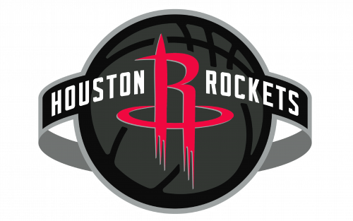
Houston Rockets Logo

Houston Rockets Logo
  • Version
  • Download 27
  • File Size 176.95 KB
  • File Count 3
  • Create Date December 14, 2024
  • Last Updated December 14, 2024
Download

The "rocket" motif has remained central to every Houston Rockets logo, symbolizing speed, ambition, and progress. Among these designs, the current logo stands out as the most refined and contemporary.

Evolution and Meaning

The Houston Rockets franchise began in 1967 in San Diego, initially struggling to find success. However, the team's fortunes improved after relocating to Houston in 1971. Over the years, the Rockets' visual identity has evolved significantly, with its "Ketchup and Mustard" era logos being some of the most iconic and cherished by fans.

1967 – 1971: San Diego Roots

The inaugural logo for the San Diego Rockets featured an orange basketball encased in a thick green circle with yellow text along its border. A blue rocket streaked diagonally across the basketball, symbolizing dynamism and growth.

1971 – 1972: A Bold New Look in Houston

Following the move to Houston, the team introduced a colorful and playful design. This logo depicted a caricatured basketball player strapped to a rocket, rendered in the now-famous red and yellow palette. Though vibrant and whimsical, this design lasted only one season.

1972 – 1995: Iconic Simplicity

In 1972, the Rockets unveiled a sleeker badge: a mustard-yellow basketball with white seams, encircled by a red frame. The upper part of the frame featured the word "Houston" in white, while "Rockets" appeared in black italics across the ball. This minimalist and professional emblem endured for over two decades.

1995 – 2003: A Dynamic Update

The 1995 redesign introduced a bold red basketball with a stylized "Rockets" wordmark in white and gray, surrounded by a smooth blue orbit. A cartoonish rocket added flair, creating a fun and energetic vibe.

2003 – 2019: Streamlined and Futuristic

The 2003 overhaul marked a departure from playful designs. A sleek red "R" resembling a rocket flame became the centerpiece, encircled by a horizontal orbit. Flanked by the team’s name in a custom sans-serif typeface, the logo exuded modernity and strength.

2019 – Today: Refined Minimalism

The current logo, introduced in 2019, integrates the signature red "R" within a black and gray basketball. Surrounding the ball is a gray and black orbit bearing the team's name in white sans-serif text. This clean, modern design emphasizes sophistication and versatility, with the red "R" often standing alone as a secondary mark.

Font and Colors

The custom-designed typeface used in the Rockets' logo features angular details reminiscent of rocket shapes, reinforcing the theme.

The primary colors of the logo are red (PMS 200) and white, with additional shades like silver (PMS 877) and black (PMS Black) used for alternate versions. These variations allow flexibility across different branding materials.

Color Breakdown:

  • Red: #CE1141 (RGB: 206, 17, 65; CMYK: 0, 100, 65, 15)
  • Black: #000000 (RGB: 6, 25, 34; CMYK: 30, 0, 0, 100)
  • Silver: #C4CED4 (RGB: 196, 206, 211; CMYK: 5, 0, 0, 20)

The Rockets' commitment to dynamic and forward-looking designs mirrors their competitive spirit and ongoing evolution as a franchise.

FileAction
Houston Rockets Logo.pngDownload

Table of Contents

I am looking for...

News
Scholarships & Financial Aid
Academic Success
College and Career
Resources

Submit a Post

Please enable JavaScript in your browser to complete this form.
Post Content
Click or drag a file to this area to upload.
Checkboxes
Name
Newsletter png
Receive the latest news, Scholarships and updates
Join Our Whatsapp Update Group👇👇

Subscribe To Our Weekly Newsletter