- Version
- Download 28
- File Size 66.20 KB
- File Count 1
- Create Date December 11, 2024
- Last Updated December 11, 2024
The Hartford Wolf Pack is one of the oldest continuously operating minor-league ice hockey teams in North America, with its history tracing back to 1926. The franchise has undergone several name and logo changes over the years, evolving its visual identity to reflect the team’s progress and competitive spirit. Below is a look at the logo history and design evolution of the team:
Logo Evolution
1936 — 1968: The Early Years
The first logo, introduced in 1936, featured a playful, black-and-white caricature of a rooster in a hockey uniform, holding a stick in its wing-hands. The rooster was depicted on a white jersey with the word "Reds" written diagonally in a bold, geometric serif font. This design was in place for over 30 years, embodying a fun and spirited tone for the team.
1968 — 1975: Minimalism and Confidence
In 1968, the logo was redesigned with a more minimalist, streamlined look. A stylized rooster profile was set inside a red circular frame, with a clean white background and bold red accents. This redesign gave the team a more confident and professional appearance, signaling its growing seriousness as a competitor.
1975 — 1977: Full-Length Rooster
In 1975, the logo was further refined, featuring a full-length rooster running to the left, now depicted in dark red. The emblem was placed on a white circle with black framing, and the wordmark "Providence Reds" encircled the logo. The rooster's legs and beak were accented with yellow, adding a vibrant touch to the overall design.
1977 — 1980: Broome Dusters
In 1977, the team was renamed the Broome Dusters. The new logo incorporated black, white, and gold, with a playful design that included a man holding a long hockey stick. The typeface was a mix of slanted classic sans-serif for "Broome" and italicized, bold letters for "Dusters."
1980 — 1990: Binghamton Whalers
In 1980, the team underwent another name change, becoming the Binghamton Whalers. The logo used bold, minimalist elements with a green whale’s tail integrated into the letter "B." The color scheme was bright and fresh, combining green, blue, and white.
1990 — 1997: New York Rangers Affiliate
In 1990, the team became affiliated with the New York Rangers, and a new logo was introduced. The design featured a white, red, and blue crest with "New York" at the top and "Rangers" diagonally across the middle, creating a shield effect.
1997 — 2010: Hartford Wolf Pack Logo
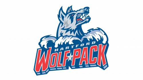
In 1997, the Hartford Wolf Pack name and logo were adopted. This new logo featured a fierce wolf with sharp teeth and intense red eyes, emphasizing strength and intimidation. The wolf's mouth was open, adding to its aggressive and powerful appearance, while the color palette played on bold reds and blues.
2010 — 2013: Connecticut Whale
In 2010, the team rebranded as the Connecticut Whale, introducing a new logo featuring a green "C" with a blue whale swimming out of it. The whale was holding a white hockey stick, giving it a unique and dynamic look. The green and blue color scheme harked back to the team’s roots while signaling a fresh identity.
2013 — Present: Return to the Wolf Pack
In 2013, the team returned to the Hartford Wolf Pack name and logo, albeit with an updated design. The refined logo featured a darker, more intense color palette, which made the wolf appear even more intimidating. The design retained the core elements from the 1997 logo, but the deeper colors and stronger contrasts gave the emblem a more powerful presence. The red accents were made more vibrant, and the wordmark became more prominent, enhancing the logo's visual impact.
Colors
The modern Hartford Wolf Pack logo uses a combination of two shades of blue and two shades of grey, creating a striking 3D effect. The intense blue and grey palette provides a solid foundation for the bold red details, ensuring the logo stands out and maintains a strong visual identity.
The Hartford Wolf Pack logo has undergone multiple transformations, reflecting the team’s evolving identity over the decades. From the playful rooster in the early years to the fierce, powerful wolf that represents the team today, the logo has grown into a symbol of strength, confidence, and competitive spirit. The use of bold colors and minimalist design continues to capture the essence of the team and its long-standing history in professional ice hockey.
| File | Action |
|---|---|
| Hartford Wolf Pack Logo.png | Download |


