- Version
- Download 60
- File Size 19.74 KB
- File Count 1
- Create Date November 29, 2024
- Last Updated December 3, 2024
EMS, or Express Mail Service, is a prominent international expedited delivery service that operates in more than 190 countries as part of the Universal Postal Union (UPU). EMS shipments are prioritized for air transport, ensuring swift and reliable delivery. Typically, packages reach their destination within 7–10 days, making EMS an ideal choice for customers requiring quick international shipping.
What Is EMS?
EMS stands for Express Mail Service, a global postal cooperative established to streamline and expedite mail and package delivery. It functions within the UPU framework, which dates back to the 1870s and now includes 192 member countries. This collaboration ensures that EMS is a trusted solution for international deliveries, prioritizing speed and efficiency.
EMS Logo: Symbolism and Evolution
The EMS logo is a striking emblem of speed, efficiency, and global connectivity. Its design has evolved over the years but consistently incorporates elements inspired by wings—historically recognized as symbols of speed and travel.
1986
The earlier EMS logo featured the acronym “EMS” composed of blue and white stripes, giving it a light and airy feel. The design emphasized motion and dynamic energy, aligning with the brand’s mission to provide fast delivery services.
1988 – Today
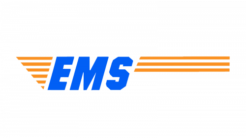
The modern EMS logo uses an energetic orange and blue color scheme. The abbreviation “EMS” appears in bold, italicized lettering, signifying forward movement. The stylized "S" with angular curves adds a contemporary touch.
To the left of the text, six orange stripes form a triangular wing motif, symbolizing speed and precision. On the right, three horizontal orange stripes create a rectangular tail-like extension, adaptable in length depending on the placement context. This sleek design ensures global recognition and reinforces the brand's identity.
Design Details
- Font: The bold, italicized typeface strikes a balance between weight and agility, while the angular “S” lends a unique, modern aesthetic.
- Colors: The orange represents energy and enthusiasm, while the blue conveys trust and reliability, reflecting EMS's commitment to efficiency and quality.
EMS Cooperative and Global Reach
The EMS Cooperative, established in 1998, aims to unify and enhance postal services worldwide. By fostering collaboration among its member postal administrations, EMS has become a cornerstone of international express mail services.
Today, EMS connects people and businesses across diverse regions, offering a reliable and efficient solution for international shipping needs. Its commitment to speed and excellence has cemented its reputation as a global leader in express mail delivery.
| File | Action |
|---|---|
| EMS Logo.png | Download |


