- Version
- Download
- File Size 71.79 KB
- File Count 1
- Create Date November 28, 2024
- Last Updated November 30, 2024
The Department of Social Welfare and Development (DSWD) logo is a masterful design that serves dual purposes: reflecting its governmental ties and embodying the organization’s mission. The design borrows heavily from the national identity, using elements and colors inspired by the Philippine flag while also showcasing the DSWD’s commitment to social welfare.
The Mission Behind the Logo
DSWD, an executive department of the Philippine government, has a long history rooted in protecting citizens' rights and promoting social development. The organization’s journey began in 1915 with the Public Welfare Board, later evolving into the Bureau of Public Welfare in 1921 under the Department of Public Instruction. After several renamings, it finally adopted its current name in 1987. Since its establishment, the DSWD has remained committed to uplifting and safeguarding the Filipino community.
The Symbolism of the Logo
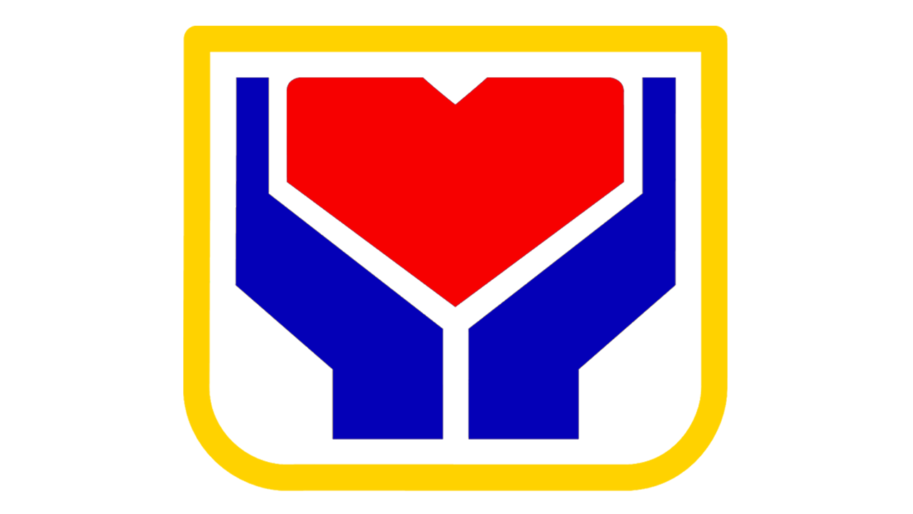
At first glance, the DSWD logo might appear as a schematic diagram, such as a building layout. However, closer inspection reveals a deeper meaning. The central red heart represents the people, highlighting their role as the organization’s primary focus. While the heart is stylized, it remains recognizable, symbolizing care and compassion. Two blue hands encircle the heart, symbolizing protection and support, aligning with the DSWD’s mission to ensure citizens' welfare and maximize their opportunities. Adding to the positive tone, a yellow outline surrounds the design, bringing warmth and optimism.
The logo also exists in a full version where the acronym "DSWD" appears beside the emblem, accompanied by the organization’s full name in smaller text beneath. The font style used is simple yet cohesive with the pictorial elements. The larger letters share unique design elements, such as flattened angles, mirroring details in the heart emblem to create a unified visual identity.
Connection to the Philippine Flag and Local Symbolism
The color scheme—red, blue, yellow, and white—directly mirrors the national flag, reinforcing the DSWD’s governmental identity. Structural similarities between the logo and the flag further emphasize this connection. When the Philippine flag is rotated 90 degrees, the sharp angular shapes resemble the DSWD emblem’s heart and hands. Additionally, the logo’s design draws inspiration from the emblem of Quezon City, where the DSWD headquarters is based. This link is deliberate, as Quezon City's emblem also reflects elements of the national flag.
Evolution of the Logo
Though documentation of the logo’s full evolution is scarce, a comparison between the old and current versions reveals subtle updates. In the older version, the white triangle atop the heart is more pronounced, and the yellow outline’s lower corners are more rounded. These refinements enhance the modern logo’s clarity and visual appeal, making it more aligned with contemporary design standards.
The DSWD logo is more than a graphic; it’s a representation of the organization’s history, mission, and dedication to the Filipino people. Through its thoughtful design, it connects with national identity while standing out as a symbol of hope and care.
| File | |
|---|---|
| DSWD-Logo.png |


