- Version
- Download 23
- File Size 44.29 KB
- File Count 1
- Create Date December 12, 2024
- Last Updated December 12, 2024
The Detroit Red Wings logo is a classic example of consistency and legacy in sports branding. Since its inception in 1933, the logo has remained largely unchanged, with only subtle refinements made in the subsequent decades, creating a strong, recognizable identity for the team. Here's a breakdown of its evolution:
Early Years (1926–1933)
The Detroit Red Wings were initially known as the Detroit Cougars and later the Detroit Falcons. Their early logos were fairly simple, reflecting the team's identity through bold and straightforward designs. The 1927 logo for the Cougars featured a gothic-style letter “D” in scarlet red, symbolizing passion and power.
The Shift to Falcons and Red Wings (1931–1933)
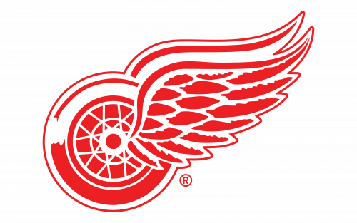
In 1931, after a name change to the Detroit Falcons, the team unveiled a new logo that was more dynamic. It featured a two-level wordmark with yellow and red colors, giving it a stronger, more energetic vibe. However, the most significant change came in 1933 when the team adopted the name "Red Wings" and introduced the iconic winged wheel logo. This symbol, a wheel with wings attached to its right side, became a hallmark of the team, tying it to the city’s automotive history.
Refinements (1935–1949)
The 1935 redesign of the logo brought a darker, burgundy-red hue, lending a sense of professionalism and gravitas. The wings were shortened and adjusted, with a more balanced red-to-white ratio. The most important refinement came in 1949, when the logo became more streamlined, with elongated wings now pointing upwards. This version of the logo has remained in use since then, providing a clean, sharp representation of the team’s identity.
Symbolism
The Red Wings' iconic winged wheel logo was inspired by team owner James Norris’s childhood connection to the MAAA Winged Wheelers, a club he once belonged to. The winged wheel also had deep ties to Detroit’s automotive heritage, symbolizing speed, precision, and engineering excellence. This symbol would go on to help the Red Wings secure their first Stanley Cup victory in 1936, marking the beginning of their storied success.
Typography and Color Palette
The wordmark associated with the Red Wings logo is distinctive with its retro, extended letterforms, particularly the “R’s” and the “D” and “W,” which give it a nostalgic feel. The red color used in the logo (Pantone 186 C) is bold and striking, while the simplicity of the white background ensures a powerful contrast. The logo’s color scheme has remained minimalistic—red and white—reinforcing the club’s identity as determined and confident.
The Red Wings’ logo is an emblem of tradition and excellence, embodying the team’s long-standing success in the NHL and its ties to the city of Detroit. The emblem’s simplicity and enduring nature have made it one of the most recognized logos in professional sports.
| File | Action |
|---|---|
| Detroit Red Wings Logo.png | Download |


