- Version
- Download 74
- File Size 118.43 KB
- File Count 2
- Create Date November 25, 2024
- Last Updated November 30, 2024
Crystal Palace Football Club, a prominent English professional football club, was officially founded in 1905, though its origins trace back to 1895. Named after the historic Crystal Palace Exhibition building in Selhurst, London, the club has a rich history and a vibrant fan base. Over the years, Crystal Palace has competed in English football’s top tiers, including the Premier League, and reached notable milestones such as FA Cup finals in 1990 and 2016. Known for its resilience and competitiveness, the club continues to build on its legacy, operating from its home at Selhurst Park in South London.
Meaning and History
Crystal Palace’s name and identity are inspired by the famous exhibition building, symbolizing its deep historical roots. Despite never achieving monumental success in the Premier League, the club has cemented its reputation as a determined and spirited competitor, always striving to secure its position among England’s footballing elite.
Logo Evolution
1935–1955
The club’s first badge was a simple, elegant square design in dark burgundy, featuring “CP” and “FC” in smooth orange and blue letters, representing “Crystal Palace Football Club.” The minimalistic style established a foundation for future designs.
1955–1960s
In 1955, the logo became more intricate, introducing a black-and-white palace image with a burgundy and blue crest in the center. A bold “Crystal Palace FC” wordmark appeared on a white ribbon beneath the palace, creating a balanced and dignified look.
1960s–1964
A redesign in the 1960s featured a detailed gray palace framed in gold. The logo conveyed elegance and heritage, with a bold black logotype placed on a wide, wavy ribbon below the image.
1964–1974
The club adopted a bright, minimalist crest design in 1964, with the left side in vivid blue and the right in scarlet red, separated by a thick vertical white line. This simple yet striking badge emphasized the club’s identity with bold colors.
1967–1972
A solid burgundy square logo with yellow diagonal cursive lettering marked a shift to a more artistic style. The vibrant colors reflected the club’s dynamic character.
1972–1973
In 1972, a modern, minimalist circular badge was introduced. The light blue “CP” monogram appeared in the center, surrounded by a burgundy frame with sans-serif lettering around the perimeter.
1973–1987
The iconic eagle symbol first appeared in 1973. A circular badge with bold blue lettering featured a white eagle on a red background holding a football. This design marked the beginning of the club’s modern branding.
1987–1994
The eagle and palace imagery were refined, and the logo’s colors shifted to shades of blue and red. The eagle perched above the palace, and the white lettering arched across two red ribbons beneath it.
1994–2013
The eagle gained a more aggressive, realistic look in 1994. The design retained the structure of its predecessor but exuded a fiercer attitude, aligning with the club’s evolving identity.
2013–2022
The club revisited its 1973 design, modernizing it for the 2013/14 season. While inspired by the earlier badge, it introduced contemporary elements for a fresh appeal.
2020–Present
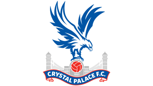
The current logo maintains the composition of the 2013 version but adopts lighter and brighter shades of blue and red. These colors symbolize strength, responsibility, and the club’s commitment to excellence, while gray and white add balance.
Color and Symbolism
The dark blue in the logo represents trust and stability, paired with a noble red that conveys passion and strength. Gray and white serve as complementary tones, enhancing the design’s overall elegance and professionalism. The eagle and palace symbolize the club’s heritage and determination, creating a visual identity that resonates with its fans and legacy.


