- Version
- Download 97
- File Size 24.14 KB
- File Count 1
- Create Date December 10, 2024
- Last Updated December 10, 2024
Columbus Crew SC is a professional soccer club based in Columbus, Ohio, founded in 1994. The team joined Major League Soccer (MLS) in 1996 as one of its founding members. Though not widely recognized for major wins, the Crew SC remains a significant part of the league. Owned by Dee and Jimmy Haslam, with Caleb Porter serving as head coach, the Crew has been a key part of MLS history. The club plays at Mapfre Stadium, the first soccer-specific stadium in MLS, located in Columbus.
Columbus Crew SC Logo History
The logo of Columbus Crew SC has evolved over the years, with a major redesign in 2014 that changed the club's visual identity.
1996 — 2014
The original logo was introduced in 1996 and reflected the club's name and roots. It depicted a crew of three men in miners’ helmets, in black and white, on a gray background. The logo was enclosed in a black shield-shaped frame, with the "Crew" name in black, bold, serif font at the top. The addition of “The” above in a sans-serif font emphasized the team’s identity and roots, symbolizing the tough, industrious spirit of the team and the region. This logo stayed with the club for almost two decades, representing its connection to its history and community.
2014 — 2021
In 2014, Columbus Crew SC added "SC" to the club’s name and introduced a new logo. This design featured a rounded black circle with yellow outlines, representing the team's bold, energetic character. Inside the circle was a diagonal split pattern: the top left had stripes and the bottom left had a checkered pattern. The year "96" (for the club’s founding year) was placed on the striped part. The simplified black and yellow color scheme and white bold lettering symbolized the club’s strength, power, and loyalty.
2021
In 2021, the logo underwent another redesign, becoming more modern and streamlined. The central element was a banner shape with two tips at the bottom, predominantly black with a yellow outline. Inside the banner, a bold white "C" was featured in a unique, sharp font. The word “Columbus” was written above the crest, and “SC” was placed below in the free space between the two tips. This sleek and modern design reflected the club's forward-thinking approach.
2021 — Today
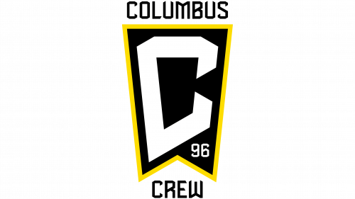
In the same year, the logo was further updated. The “SC” was replaced with the word “Crew”, and the founding year “96” was added inside one of the tips, further solidifying the team’s legacy. The updated logo reflects the club's growth and evolution while retaining its strong identity.
Font and Color Palette
The Columbus Crew SC logo uses a modern, sharp font for its wordmark, which has unique, angular elements. The typeface is inspired by commercial fonts like Starstone, Black Blocker, or Enamela, but with notable modifications.
The club’s color palette of black, yellow, and white is a powerful visual representation of the team's energy and ambition, symbolizing strength, progressiveness, and determination.
Columbus Crew SC Colors
- Yellow
- Pantone: PMS 803 C
- Hex: #FEF200
- RGB: (254, 242, 0)
- CMYK: (4, 0, 93, 0)
- Black
- Pantone: PMS Black 3 C
- Hex: #231F20
- RGB: (35, 31, 32)
- CMYK: (70, 67, 64, 74)
These colors emphasize the club’s focus on strength, energy, and competitive spirit.
| File | Action |
|---|---|
| Columbus Crew SC Logo.png | Download |


