- Version
- Download 93
- File Size 133.73 KB
- File Count 1
- Create Date November 29, 2024
- Last Updated November 30, 2024
The Cal Poly Mustangs athletic program, representing California Polytechnic State University in San Luis Obispo, carries a strong tradition of competitive excellence. Established in 1901, Cal Poly's sports teams compete in the NCAA Division I across 21 disciplines, including basketball, football, baseball, golf, and wrestling. The program's visual identity, particularly its logo, reflects its values of strength, speed, and tradition.
Meaning and History of the Logo
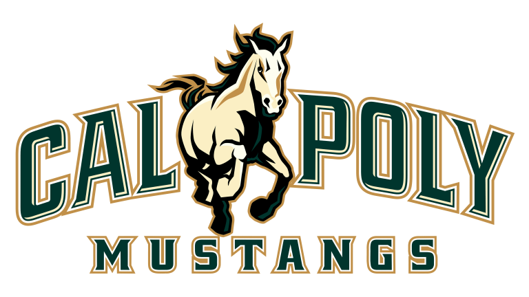
The visual identity of the Cal Poly Mustangs has seen only one redesign since 1999, demonstrating a consistent and cohesive approach. The logo's central focus is a dynamic and powerful Mustang, the university's mascot, symbolizing the determination and competitive spirit of its athletic teams.
1999 – 2006: The Original Logo
The initial design introduced in 1999 featured a running Mustang at its core, rendered in a light cream shade with green and white accents. The horse was outlined in bold black with gold details, giving the design depth and energy.
The wordmark encircling the horse was split into two parts:
"Cal Poly" appeared in an arch above the Mustang, using an uppercase serif typeface with sharp, triangular accents. The letters were green with white and gold outlines.
"Mustang" was placed beneath the horse in a straight line, with a white outline that was almost imperceptible.
This logo was a strong representation of the university's heritage and athletic prowess.
2007 – Present: Modern Refinements
The 2007 redesign retained the original composition and layout but introduced subtle updates for a more polished appearance:
Color Adjustments: The green of the wordmark was darkened to a richer shade, while thin white lines were added around the letters to enhance their visual impact.
Improved Wordmark: The "Mustang" lettering now features a thicker white outline, making it more prominent and readable.
Updated Mustang: The horse’s green accents were replaced with dark gold, giving it a more cohesive and elegant appearance. The creamy brown palette for the Mustang added a sense of refinement and continuity.
These updates modernized the logo while preserving its essence, reflecting the evolution of Cal Poly’s athletic program.
Font and Color Palette
The logo employs a bold and traditional serif typeface with sharp edges and triangular details, embodying both elegance and strength.
Color Palette:
Green: Represents growth, vitality, and Cal Poly’s academic and athletic ambitions.
Gold: Symbolizes excellence and tradition.
White and Cream: Add balance and clarity to the design.
Black: Provides a grounding and bold outline, emphasizing the dynamic elements of the logo.
What is Cal Poly Mustangs?
Cal Poly Mustangs refers to the collective athletic teams of California Polytechnic State University. Competing in the NCAA’s Division I, they are part of prestigious conferences such as the Big Sky for football, Mountain Pacific Sports Federation for swimming and diving, and the Pac-12 for wrestling. Known for their competitive spirit and skill, the Mustangs continue to uphold the university's rich tradition in athletics.
The logo captures the essence of this storied program, showcasing a blend of heritage, strength, and modernity that resonates with fans, athletes, and the university community alike.
| File | Action |
|---|---|
| Cal-Poly-Mustangs-Logo-768x432.png | Download |


