- Version
- Download 214
- File Size 414.11 KB
- File Count 3
- Create Date December 13, 2024
- Last Updated December 13, 2024
The Black Panther logo has evolved significantly since the superhero's debut in 1966. Created by Stan Lee and Jack Kirby, Black Panther first appeared in Fantastic Four #52, where he was introduced as a fierce and mysterious warrior king. Over time, the character has become one of Marvel Comics’ most iconic superheroes, gaining global recognition through both the comics and the 2018 movie.
Logo Evolution and Design
Early Logos and Concept (1966–2016)
The first versions of the Black Panther logo were bold and striking, designed to reflect the character's strength and regal stature. The earliest logo featured clean lines and a stylized panther, symbolizing power, stealth, and agility.
In 2016, the logo went through a significant redesign by the comic lettering and design studio, Comicraft. The goal was to capture the streetwise essence of Black Panther's persona, especially given that the story was set in New York City. The wordmark-based logo emphasized the word “PANTHER” by making the letters "P" and "R" taller, with the word “BLACK” positioned above. The “N” was designed with a spiky pointed end, representing the superhero’s claws, while outline and shadow effects gave the logo a 3D look. This version was dynamic and energetic, giving a sense of movement and modernity.
2016–2018 Movie Tie-in Logo
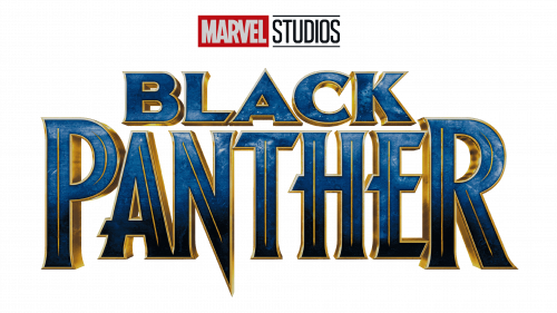
Leading up to the release of the Black Panther movie in 2018, Marvel Studios opted for a fresh interpretation of the logo. This version adopted a more minimalist, modern design, influenced by futuristic elements. The typography was sleek, with a punk-rock edge that aligned with the character's evolution. The updated logo still retained echoes of the classic comic design but was more restrained in color and form.
The logo used in the 2018 Black Panther film featured a futuristic sans-serif font called BEYNO, created by designer Fabian Korn. This new typeface was less shiny and colorful, providing a more subdued, powerful aesthetic that resonated with the character's royal status and the movie's darker, more serious tone.
Font and Color Palette
The primary Black Panther logo features bold, sharp uppercase lettering with elongated, pointed lines. The font is a custom design that closely resembles Prince of Darkness, with some modifications to suit the character's powerful, noble persona. The font's condensed, narrow contours convey a sense of sleekness and agility.
The color scheme of the logo is a rich blend of dark blue and gold, creating a striking contrast. The dark blue evokes feelings of mystery, adventure, and the unknown, while the gold adds a timeless, regal touch, reflecting Black Panther's royal heritage. The use of gradients and gloss in the logo further emphasizes motion and energy, giving it a sense of life and vitality.
Symbolism and Meaning
The Black Panther logo is more than just a design; it reflects the essence of the character and his story. As the ruler of the fictional African nation of Wakanda, the Black Panther is both a warrior and a king, and his logo incorporates symbols of strength, resilience, and authority. The sharp, angular lines in the design evoke the agility of a panther, while the use of bold colors and modern typography speaks to both the character’s historical roots and his contemporary significance.
In summary, the Black Panther logo has evolved from its comic origins to reflect the character’s growth, both in the Marvel universe and within popular culture. From the 1966 introduction to the 2018 film, the logo has maintained its iconic status while adapting to the changing narrative and aesthetics of the franchise.


