- Version
- Download 33
- File Size 23.28 KB
- File Count 1
- Create Date December 13, 2024
- Last Updated December 13, 2024
Beats by Dr. Dre, founded in 2006 by music producer Jimmy Iovine and rapper Dr. Dre, has become a leading brand in the audio industry, particularly known for its headphones and portable speakers. In 2014, the brand was acquired by Apple, further cementing its status as a prominent name in consumer electronics.
Name and Meaning
The name "Beats" is derived from the musical term "beat," representing the central rhythm of music. This choice highlights the brand’s focus on sound quality and music culture. Beats by Dr. Dre is not just a brand but a celebration of music, with an emphasis on delivering high-quality audio experiences.
Logo Design
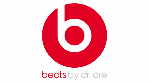
The Beats by Dr. Dre logo is instantly recognizable and combines a bold emblem with a smooth, modern wordmark. The main icon consists of a simple, stylized lowercase "b" placed within a red circle. The letter "b" symbolizes both the brand's name and the shape of the headphones, creating a dynamic and sleek design. The circle surrounding the "b" can also be interpreted as the shape of the headphones' ear cups, reinforcing the brand’s connection to audio products.
The wordmark accompanying the logo is set in a lowercase sans-serif font, with smooth, rounded characters that complement the simple yet powerful emblem. The clean lines and modern aesthetic of the wordmark contribute to the overall sleek and contemporary look of the logo.
Symbolism and Color Palette
The Beats logo is minimalist but effective, using a combination of red, white, and black to convey prestige, power, and energy. The red circle with a white "b" inside stands out against the black background, making it visually striking and memorable. The color scheme is both elegant and bold, reflecting the brand’s high-end positioning and strong association with music culture.
The logo's simplicity adds to its versatility, ensuring it remains iconic and recognizable across various platforms and product designs. The use of red and black also conveys excitement, passion, and excellence, qualities that the brand strives to embody in its products.
Font and Typography
The typography used for the Beats wordmark is modern and clean, with a rounded, sans-serif style. The closest fonts to the one used in the Beats logo are Harry Plain and Yaro Rg Thin, although the logo features slight modifications to create a unique look. This typeface contributes to the brand’s modern, sleek image, ensuring legibility and consistency across all marketing materials.
Conclusion
The Beats by Dr. Dre logo is a perfect example of minimalist design with maximum impact. Its simple yet powerful elements—red, white, and black—create a bold statement that reflects the brand's commitment to excellence and innovation in the audio industry. Through its visual identity, Beats successfully communicates its passion for music and the superior sound experience it provides to its consumers.
| File | Action |
|---|---|
| Beats by Dre Logo.png | Download |


