- Version
- Download 79
- File Size 8.26 KB
- File Count 1
- Create Date December 12, 2024
- Last Updated December 12, 2024
7-Eleven is a renowned global convenience store chain, established in 1927 under the original name Tote'm stores. Today, it operates nearly 70,000 stores across 17 countries, offering a wide range of drinks, snacks, and prepared foods, and is known for its 24/7 availability.
The Evolution of the 7-Eleven Logo
The 7-Eleven logo has evolved significantly over the years, reflecting the growth and transformation of the company. Here's a look at its history:
1927 – 1945: The Totem Symbol
The original name, Tote’m stores, was accompanied by a unique logo featuring a large wooden totem. The totem symbol replaced the first letter "T" in the store's wordmark, making it instantly recognizable across the U.S.
1945 – 1950: The 7-Eleven Name Emerges
In 1946, the company decided to expand its operating hours and began using the name 7-Eleven to highlight their new hours: 7 AM to 11 PM. This new name was so popular that it stuck, even after the company switched to 24-hour operation in 1963.
1950 – 1956: Early Logo Designs
The first logo after the name change appeared in 1946. It featured a bold red “7” inside a white trapezoid, set against a green circle. The word "Eleven" was placed diagonally across the number, giving the logo a dynamic and modern feel that reflected the company’s growth. This logo would be the basis for several future designs.
1956 – 1960: Refining the Design
By 1956, the logo underwent subtle refinements. The "7" was enlarged, and its outline thinned, giving the logo a more airy and modern look. The wordmark also became more streamlined, with the shadow of the text lightened to create a cleaner aesthetic.
1960 – 1963: Simplification
In the 1960 redesign, the color palette was simplified to black and white. The gradients and gray tones were removed, and the overall design became more minimalist, with a focus on the clean shapes of the number and letters. This design remained in use for several years.
1963 – 1968: Adding a Green Background
In 1963, the logo was updated again, with the number "7" and the word "Eleven" placed within a solid green roundel. This version saw a sleeker trapezoid with sharper angles and a thin outline, further enhancing the visual distinction of the logo.
1968 – 2004: Brightening the Color Palette
In 1969, the logo took on a fresh look, with the "7" now in a combination of red and orange. The word "Eleven" was re-positioned horizontally, and the "N" was lowered to create a friendlier look. The design was more vibrant, adding a sense of energy and playfulness.
1975 – 1986: New Shape and Colors
The 1975 redesign featured a rectangular shape rather than a circular background. The green became lighter and more vibrant, giving the logo a brighter and more cheerful appearance. This version was designed to evoke a sense of freshness and modernity.
1986 – 1989: Refining the Look
In 1986, the color palette was darkened slightly, and the trapezoid was moved lower to create a more balanced and harmonious look. The contours of the letters and number were refined for a cleaner and more modern feel.
1989 – 2021: Iconic Redesign
The 1989 logo became the cornerstone of the brand's identity for several decades. It featured a dark green rectangle with a white trapezoid in the center, along with a bold "7" in red and orange, and a green "Eleven" wordmark. This design solidified the 7-Eleven brand as both professional and modern.
2013 – 2021: Minor Refinements
In 2013, the logo was given a significant update. The "7" was placed directly on the green background, and the word "Eleven" was re-written in lowercase using a modern sans-serif font. The overall effect was a more sleek, contemporary design that conveyed a more polished and approachable brand identity.
2021 – Present: Returning to Simplicity
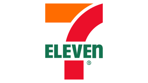
The 2021 redesign returned to a more traditional approach, taking inspiration from the 1990s logo. The green background was removed, leaving just the red and orange "7" and the green uppercase "Eleven" on a plain white background. This version refined the look even further, with a darker shade of green for the wordmark, making it stand out even more.
Font and Logo Characteristics
The 7-Eleven logo uses a bold, sans-serif font with an uppercase “7” and a lowercase “n” in the word “Eleven,” which adds a playful, distinctive touch. The font is similar to Filmotype Manchester, with thick, straight lines that suggest stability and reliability. The use of red and green conveys energy and vibrancy, while the minimal design keeps the logo modern and approachable.
Today, 7-Eleven is not only a household name in convenience stores but also an iconic symbol in global retail. The logo's evolution reflects the company’s growth and adaption to new markets, while maintaining a consistent identity that resonates with consumers worldwide. From its humble beginnings as Tote’m stores to its current global presence, 7-Eleven continues to thrive as a leader in convenience retail.
| File | Action |
|---|---|
| 7-Eleven Logo.png | Download |


