- Version
- Download 27
- File Size 85.13 KB
- File Count 1
- Create Date December 6, 2024
- Last Updated December 6, 2024
The Sacramento River Cats, originally founded as the Vancouver Canadians in 1978, moved to California in 2000 and adopted their current name. As part of the Pacific Coast League, the team has been the Triple-A affiliate of the San Francisco Giants since 2015. Their logo and brand have evolved over time, though key elements have remained consistent.
Meaning and History
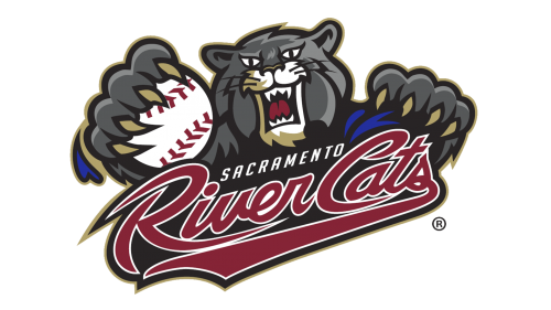
The River Cats’ logo has undergone at least one significant redesign, yet it has always kept its central mascot: a grumpy, large grey cat with sharp claws and a fierce expression. This cat has become an iconic figure for the team, symbolizing the gritty and competitive nature of minor league baseball. The team's name, "River Cats," and the presence of a cat in the logo align with their location near the Sacramento River and contribute to a bold, regional identity.
Logo History
2000-2006: Initial Logo
The first version of the Sacramento River Cats logo featured the team's mascot, a large cat with a baseball in its paw. The background prominently featured the Tower Bridge, a landmark of Sacramento, adding a sense of local pride to the design. This logo captured the energetic and playful nature of a minor league team while also embracing its connection to the city.
2007-Present: Updated Logo
In 2007, the River Cats introduced a more streamlined and refined logo, while maintaining the grumpy cat mascot at its core. The cat's expression and posture remained the same, with its ferocious glare and sharp claws, but the design was made more monolithic. The text was repositioned and updated to reflect a more modern style, but the essence of the team remained unchanged. The color scheme and overall mood of the logo stayed consistent, reinforcing the team's brand identity.
Colors
The color scheme of the Sacramento River Cats logo has remained consistent, primarily featuring grey for the cat and bold accent colors that enhance the logo's intensity. This consistency may be one reason why the team’s merchandise has been successful commercially, consistently ranking among the top minor league clubs for merchandise sales.
Overall, the Sacramento River Cats logo has evolved to be more polished over time but continues to maintain the same tough, competitive spirit that fans have come to love.
| File | Action |
|---|---|
| Sacramento-River-Cats-Logo-500x281.png | Download |


