- Version
- Download 103
- File Size 116.56 KB
- File Count 2
- Create Date November 29, 2024
- Last Updated December 3, 2024
Sierra Mist, a popular soft drink brand by PepsiCo, was introduced in 1999 as a refreshing lemon-lime soda designed to compete with other citrus beverages on the market. Known for its crisp, citrusy flavor, Sierra Mist has built a loyal following across the globe. Over the years, the brand has undergone various logo and name changes, constantly evolving to reflect its commitment to freshness and rejuvenation.
What is Sierra Mist?
Sierra Mist is a lemon-lime flavored soda produced by PepsiCo, primarily marketed as a refreshing and healthier alternative to traditional sodas. The brand has experienced several changes throughout its existence, from its visual identity to its name, which was briefly changed to Mist Twist before returning to Sierra Mist in 2018. The beverage is known for its light and crisp taste, with a natural citrus flavor that appeals to consumers who enjoy fruity, effervescent drinks.
Sierra Mist Logo History: A Look at the Brand’s Evolution
The Sierra Mist logo has undergone multiple redesigns since the brand's inception. Each new iteration of the logo has aimed to better reflect the brand’s refreshing and vibrant identity, incorporating citrus elements, mountain themes, and the sense of "mist" that characterizes its name. Here's a look at the significant milestones in the evolution of Sierra Mist's logo.
1999: The Birth of Sierra Mist
The original Sierra Mist logo, introduced in 1999, featured an eye-catching design that was heavily focused on citrus imagery. The logo displayed a slice of lemon and a slice of lime in front of each other, with a subtle, surrealistic quality to their depiction. The typography was bold, with the word "Mist" in a distinctive sans-serif font, and "Sierra" placed above it. The color palette was dominated by green, yellow, and white gradients, which complemented the lemon-lime theme of the beverage. This version stayed with the brand for a short period but laid the foundation for future iterations.
2001: The Citrus Fruits Take Center Stage
In 2001, Sierra Mist underwent a major redesign. The lemon and lime imagery evolved from slices to whole fruits, reinforcing the natural citrus flavor. The word "Sierra" was now inspired by a handwritten style, and the color scheme shifted to a cleaner, more refined palette. The logo’s background subtly referenced the brand’s name, with the word "Sierra" meaning "mountain range" in Spanish, drawing on the association with nature.
2006: The Mountain Meets the Lemon
By 2006, the logo began merging elements from previous designs. The green background became blurry and less realistic, evoking the image of a misty mountain landscape. The design featured a lemony sun rising over snow-capped peaks, reinforcing the brand’s fresh, natural, and vibrant identity. The typography was updated to be more dynamic, and the overall feel was lighter, more energetic, and contemporary.
2008: Entering the "Forest Mist" Era
The 2008 redesign marked a significant shift for Sierra Mist. The logo embraced a "forest mist" theme, with a blurry background and a more subtle citrus representation. The lemon and lime were now only hinted at through the use of color rather than direct imagery, which helped give the logo a more sophisticated and modern look. The word "Mist" was presented in a foggy effect to echo the "misty" theme.
2010: The Return of the Citrus Fruits
In 2010, the logo featured a more generous representation of the citrus fruits. The design now incorporated half of a lemon and lime, symbolizing the drink’s full citrus flavor. The typography was revamped again, replacing the "fluid" typeface with a bolder, more static design. The background included water splashes, adding a dynamic element to the logo that conveyed refreshment and energy.
2013: Abstract Citrus Rings
The 2013 version of the Sierra Mist logo took a more abstract approach. The lemon and lime were no longer depicted as whole fruits but as rings with splashes around them. The "lemon-lime" flavor was explicitly included in the logo to maintain the connection to the citrus fruits. The mountain theme was also reintroduced through the shape of the "M" in Mist.
2016: Rebranding to Mist Twist
In 2016, PepsiCo rebranded Sierra Mist as Mist Twist. The logo still featured citrus imagery—this time a whole lemon and lime in front of each other, alongside a slice—but the typography was more bold and rectangular, with interesting gaps in the letters. The rebranding signaled a new direction for the product while maintaining the familiar citrus theme.
2018: Return to the Original Name and Logo Redesign
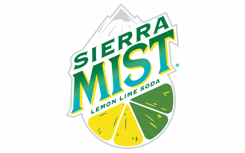
When the brand returned to Sierra Mist in 2018, the logo underwent another redesign. This version incorporated elements from earlier logos, including the mountains and the hybrid lemon-lime slice. The diagonal structure of the design gave it a dynamic and optimistic look, signaling a fresh start for the brand.
Font and Color
The Sierra Mist logo uses a custom serif typeface with thick lines and sharp serifs, resembling fonts like Porkshop Italic but with modifications to give it a unique look. The color palette primarily consists of green and yellow gradients, which symbolize energy, joy, and success. These colors, paired with a white background, evoke the freshness and lightness of citrus flavors, creating a visual identity that aligns with the refreshing nature of the beverage.


