- Version
- Download 114
- File Size 21.42 KB
- File Count 1
- Create Date November 26, 2024
- Last Updated December 3, 2024
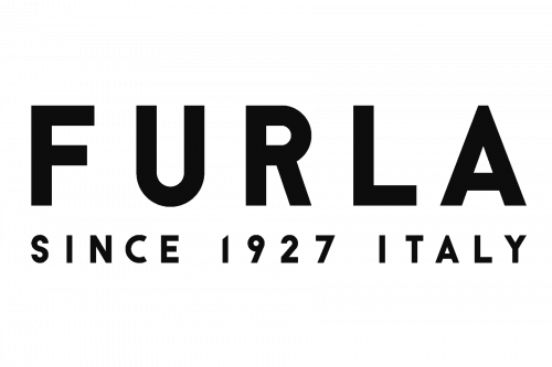
The Furla logo exemplifies minimalism and sophistication, embodying the brand's Italian heritage and commitment to quality. With its simple yet impactful design, the logo mirrors Furla's journey from a small family-run business to a globally renowned luxury brand.
Meaning and History
Founded in 1927 by Aldo Furlanetto, Furla began as a wholesale leather goods business in Bologna, Italy. Aldo’s vision was to create high-quality, stylish leather accessories for women, marking the inception of a brand that would redefine affordable luxury. The opening of Furla’s first store in 1955 on Ugo Bassi Street was a pivotal moment in its history—a store that remains operational to this day.
Over the decades, Furla has grown into a global powerhouse with over 1,600 employees across 100 countries, producing not just bags but also shoes, eyewear, and other leather accessories.
Evolution of the Furla Logo
1927–2019: The Original Serif Design
For nearly a century, Furla used a logo characterized by bold, uppercase letters in an elegant serif typeface. The clean lines and sharp triangular serifs exuded sophistication and timeless appeal, perfectly aligning with Furla’s luxurious image. The black-and-white palette emphasized clarity and versatility, ensuring the logo stood out without unnecessary embellishments.
2019–Present: A Modern Sans-Serif Look
In 2019, Furla refreshed its logo to reflect its evolution as a contemporary luxury brand. The new design retained the simplicity of black uppercase letters but adopted a geometric sans-serif typeface. This shift gave the logo a modern and bold appearance while maintaining Furla's elegance.
The update also introduced a tagline, “Since 1927 Italy,” in small capital letters beneath the primary logotype. This addition emphasizes Furla’s long-standing heritage and Italian roots.
Unique Design Features
- The “Abnormal” F
A subtle but ingenious detail lies in the letter "F," which features a small white gap resembling the curve of a high-heeled shoe. This design choice cleverly nods to Furla’s product range, which extends beyond bags to include shoes and accessories. - Font Choice
The current logo's typeface closely resembles fonts like Chamelton 10 Display Bold and Cathra Bold, with slightly condensed letters and precise cuts. This gives the logo a clean and modern aesthetic. - Color Palette
Furla’s choice of black lettering on a white background is a timeless strategy in the fashion industry. This classic palette ensures the logo’s adaptability to various mediums while maintaining an aura of luxury and sophistication.
The Essence of the Furla Brand
Furla represents a perfect blend of Italian craftsmanship, modern design, and accessibility. Its logo encapsulates this identity by being both unassuming and distinctive. The updated sans-serif font mirrors the brand’s progressive outlook, while the minimalist design pays homage to its enduring values of quality and elegance.
Whether displayed on a storefront, product label, or digital platform, the Furla logo speaks to the brand’s dedication to staying relevant while respecting its heritage. This balance between tradition and modernity has cemented Furla’s place as a beloved name in luxury fashion.
The Furla logo serves as a powerful representation of the brand’s legacy and vision. From its serif roots to its modern sans-serif iteration, the logo has evolved to reflect the brand’s growth while retaining its timeless charm. Through thoughtful design elements like the stylized “F” and its classic black-and-white palette, Furla continues to honor its Italian heritage while appealing to a global audience.
| File | Action |
|---|---|
| Furla logo.png | Download |


