- Version
- Download 87
- File Size 30.63 KB
- File Count 1
- Create Date November 25, 2024
- Last Updated November 30, 2024
Monsters, Inc. is a beloved animated film created by Pixar and released by Disney in 2001. The movie, which became an iconic piece of animation, follows the adventures of Sulley and Mike, two monster friends working Nat Monsters, Inc., a factory that generates energy from the screams of children. Its sequel, Monsters University, was released in 2013, exploring the origins of the duo's friendship.
Meaning and History of the Logo
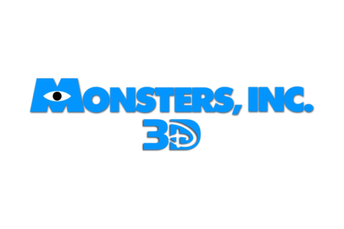
The logo design reflects the playful yet spooky essence of the movie, incorporating monster-inspired details like eyes and bold shapes. The central emblem is a bold “M” with an eye in its center, symbolizing the central theme of unique monster designs.
What is Monsters, Inc.?
Monsters, Inc. is a Pixar-animated film about a world powered by children’s screams, harvested by monsters traveling to the human world. The story centers on Sulley, a gentle giant, and Mike, his quirky one-eyed partner, as they navigate an unexpected adventure that challenges their views of the human world and their roles as scarers.
2001
The original logo features a light blue wordmark spelling "Monsters, Inc." in uppercase letters. The design uses a bold, sans-serif typeface with minimal spacing between characters. The "M" stands out as it is slightly larger and features a seed-shaped eye with a black dot in its center, adding a playful monster-like quality to the design
2012
For the 3D re-release of Monsters, Inc., the logo underwent slight refinements. The blue shade was brightened, and the lettering gained a three-dimensional appearance with subtle shading for added depth. A “3D” tagline was introduced below the main wordmark in the same bold blue style. The letter “D” featured a layered effect with the Disney cursive “D” in white overlapping the blue base, connecting the logo to Disney’s branding.
Font and Color
The logo’s heavy sans-serif typeface resembles fonts like Futura TS Heavy and Guildford Pro Titling, characterized by extra-bold strokes. The enlarged "M" in the logo distinguishes it and adds personality.
The color palette is vibrant, centering on a bright blue reminiscent of Sulley’s fur. White and black elements complement the blue, forming the eye motif in the "M" and creating contrast. This combination reflects the playful yet professional tone of the movie and aligns with its central characters' aesthetics.
| File | Action |
|---|---|
| Monsters-Inc.-logo-500x333.png | Download |


