- Version
- Download 44
- File Size 21.58 KB
- File Count 1
- Create Date November 18, 2024
- Last Updated November 18, 2024
Airtable, founded in 2012 in California, has made its mark as a versatile no-code platform for managing databases and collaborative projects. Its visual identity aligns with the brand’s core values of innovation, user-friendliness, and modernity, combining bright colors with a clean, minimalistic wordmark.
Logo Timeline
2012 – 2016: The Original Logo
- Design: The logo featured a three-dimensional geometric emblem resembling a floating cube, created by the interplay of multiple shapes and colors. The top face used a gradient transitioning from blue to teal, the left face was a vibrant yellow, and the right face had a soft purple hue.
- Wordmark: Adjacent to the emblem, the word “Airtable” was written in a simple sans-serif font. The lowercase lettering, particularly the rounded "a," gave the design a friendly and approachable vibe.
- Impression: The original logo emphasized collaboration and flexibility, with its vibrant, modern design signifying dynamism and innovation.
2016 – Present: Simplified and Balanced
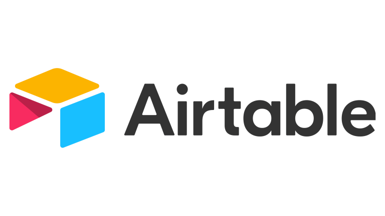
- Design: The updated logo retains its essence but refines the elements for a more contemporary look. The emblem now represents a stylized table, constructed with three geometric shapes:
- Top parallelogram: Bright yellow.
- Side parallelogram: Vivid turquoise.
- Triangular element: Pinkish-red with subtle shading for depth.
These shapes, arranged in a 3/4 perspective, symbolize Airtable’s core functionality of managing data in tables and grids.
- Wordmark: The updated typeface is a bold, clean sans-serif set in title case. The dark gray text complements the colorful emblem, adding professionalism and balance.
- Impression: The simplified design reflects modern design trends while maintaining a bright, engaging color palette that conveys creativity and progressiveness.
Key Design Elements
Font
The sans-serif typeface in the Airtable logo emphasizes clarity and accessibility. The bold, simple lines resemble fonts such as Reaktif Bold, Poligon Bold, and XXII Geom Bold, ensuring the wordmark is legible and professional.
Color Palette
The vibrant combination of yellow, turquoise, and red/pink contrasts sharply with the dark gray wordmark, creating a balance between playfulness and professionalism. These colors symbolize creativity, energy, and a forward-thinking approach.
Brand Alignment
Airtable’s visual identity perfectly captures its mission as a no-code platform that simplifies complex data management tasks. The bright colors evoke innovation and approachability, while the structured geometric design reflects the platform’s emphasis on organization and functionality. Over time, Airtable has fine-tuned its logo to resonate with its diverse user base, ranging from creative professionals to data-driven teams.
| File | Action |
|---|---|
| Airtable-Logo-768x432.png | Download |


