- Version
- Download 86
- File Size 57.37 KB
- File Count 1
- Create Date January 18, 2025
- Last Updated January 18, 2025
Linkin Park's logos have undergone numerous transformations, reflecting the band's journey, evolving identity, and music style. Despite the changes, the minimalist approach and distinctive design elements have made each version easily recognizable, resonating with fans worldwide.
Logo Evolution
1997–1999: Xero Logo
- Design:
The band’s first logo reflected its original name, Xero. It featured:- A typeface inspired by Ancient Greek letters with unconventional details:
- The “X” and “R” had cut-off halves.
- The “E” resembled a mirrored number 3.
- The “O” floated slightly above the baseline.
- A typeface inspired by Ancient Greek letters with unconventional details:
- Style:
The logo's experimental and abstract look hinted at the band's creative and innovative nature.
1999–2000: Hybrid Theory Logo
- Design:
During the short period when the band was known as Hybrid Theory, their logo consisted of strokes styled like Japanese glyphs.
This abstract emblem embodied the band's experimental and multicultural influences.
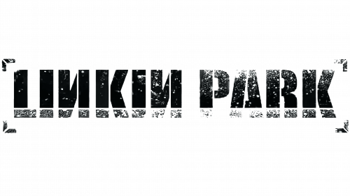
2000–2002: First Linkin Park Logo
- Design:
The first logo under the name Linkin Park introduced:- A bold sans-serif wordmark enclosed in four square brackets.
- Mirrored “N” glyphs, adding a unique visual identity.
- A gradient black-and-white palette with an "erased ink" effect, symbolizing raw energy and creativity.
2002–2003: Refined Brackets
- Changes:
- The lettering was made smaller and sleeker.
- The brackets became more prominent with defined spaces.
- A light stripe was added across the wordmark for contrast.
2003–2007: Simplified and Enlarged
- Updates:
- The mirrored “N” was replaced by a standard design for clarity.
- The brackets were redesigned with diagonal bars for a modern touch.
- The lettering was made larger, emphasizing the band’s growing confidence.
2007–2010: Bold and Dynamic
- New Design:
- The wordmark was split into two levels using extra-bold sans-serif letters.
- The elongated and sharp lines of “A” and “R” reflected the edginess of Linkin Park's music.
- This logo introduced a sense of power and aggression, resonating with their sound during this period.
2010–2017: Minimalist Era
- Approach:
- A narrow sans-serif typeface with clean, capitalized letters was used.
- The logo omitted any framing or additional elements, showcasing elegance and simplicity.
- This design aligned with the minimalistic trends of the time and symbolized the band’s maturity.
2017–2020: One More Light Logo
- Design Changes:
- A lighter and thinner typeface with more spacing between characters gave the logo an airy feel.
- Inspired by their 2017 album One More Light, the logo exuded calmness and introspection.
- Hexagonal Emblem:
- The “LP” insignia was encased in a hexagon, with each angle symbolizing one of the band’s six members.
- This design added depth and meaning to the logo, celebrating the band's unity.
2020–Today: Return to Roots
- Reintroduction:
- The band revisited their 2000 logo, making minor adjustments for modern aesthetics.
- This decision connected with nostalgia while staying contemporary.
Notable Symbols
2006: Minutes to Midnight Logo
- Design:
A single-line “LP” emblem that blurred the lines between letters and emblem. - Impact:
Its abstract, almost cryptic appearance added intrigue, reflecting the band’s experimental nature.
2017: One More Light Hexagon
- Details:
The hexagon shape provided a personal touch by representing the six band members, creating a symbol of unity and individuality.
Typography and Font
- Early Fonts:
The bold and sharp fonts of the 2000s, including reversed "N" designs, highlighted rawness and aggression. - Modern Fonts:
By 2017, the typography had transitioned to minimalistic sans-serif typefaces, embodying elegance and introspection.
Color Palette
- Black and White:
- Represents the emotional duality in their music, from aggression to introspection.
- Black symbolizes their connection to underground music culture, while white balances it with clarity.
Legacy
Linkin Park’s logos are more than just symbols; they narrate the band’s journey through evolving musical styles, emotional expressions, and design trends. Each iteration, while unique, retains the band’s core identity, ensuring it remains timeless and instantly recognizable.
| File | Action |
|---|---|
| Linkin-Park-logo-500x281.png | Download |


