- Version
- Download 55
- File Size 56.72 KB
- File Count 1
- Create Date January 3, 2025
- Last Updated January 3, 2025
Sanofi, founded in 1973, is a leading French multinational pharmaceutical corporation and one of the world’s largest drug manufacturers. Over its decades-long history, the company has undergone significant transformations. The latest shift occurred in 2009 when Sanofi merged with Aventis, further solidifying its position in the global pharmaceutical market. Despite facing challenges, such as its failure to produce a competitive COVID-19 vaccine, Sanofi remains committed to growth and innovation, which is reflected in its new visual identity.
The New Sanofi Logo: Symbolizing Innovation and Progress
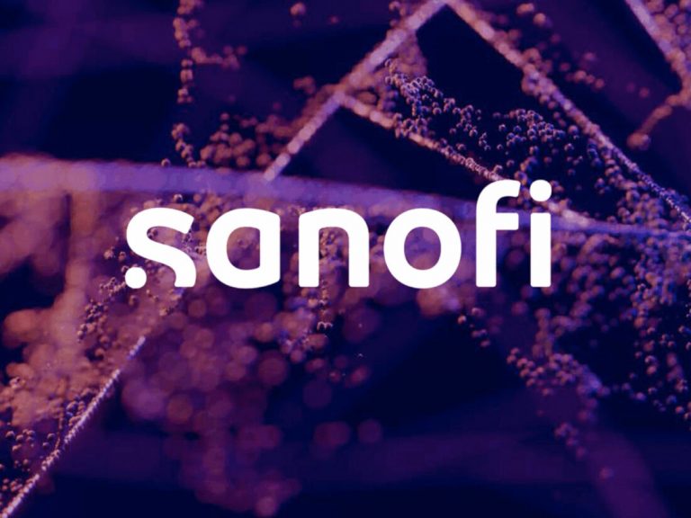
Sanofi’s rebranding aims to unite various cultures, identities, and brands under one cohesive trademark. The new logo, introduced in 2021, signifies the company's forward-thinking vision. The logo features a lowercase wordmark, which replaces the previous “Bird of Hope” emblem from 2011. The bird, which was a symbol of hope, is now replaced by a cleaner, modern typographic style. This shift marks a new chapter in Sanofi’s history, focusing on simplicity, clarity, and innovation.
In addition to the new wordmark, the brand color palette has been revamped. Sanofi has adopted purple as its primary color, moving away from the previous green-and-blue scheme. Purple symbolizes creativity, wisdom, and the scientific journey that drives Sanofi’s work in healthcare.
Meaning Behind the New Logo
According to Sanofi’s press release, the new logo was inspired by the “simple and movement-oriented codes of the technological industry”. The logo’s distinct letterforms are complemented by two purple dots. These dots symbolize a scientific journey, beginning with curiosity and the question, “What if?” and leading to moments of insight and innovation that ultimately improve people’s lives.
The Role of FutureBrand in Sanofi’s Rebranding
The rebranding of Sanofi was carried out in collaboration with FutureBrand, a Paris-based design studio. Their expertise in creating modern, impactful identities helped shape the new logo to align with Sanofi’s ambitions for the future. To further communicate this transformation, the company also released the “Our New Identity” video, showcasing the evolution of the brand and its vision.
Conclusion: Sanofi’s Commitment to the Future of Healthcare
With the introduction of a sleek, modern logo and a new color palette, Sanofi is signaling its commitment to a future focused on innovation and scientific discovery. The rebranding marks a fresh start as the company aims to unite its global presence and expand its impact on global health.
| File | Action |
|---|---|
| sanofi-logo-visual-768x576.jpg | Download |


