- Version
- Download 39
- File Size 81.27 KB
- File Count 1
- Create Date December 13, 2024
- Last Updated December 13, 2024
Bucknell Bison is the athletic program of Bucknell University, a private liberal arts institution founded in 1846 in Lewisburg, Pennsylvania. The program comprises 25 men's and women's sports teams, all competing at the NCAA Division I level. The Bison teams are members of the Patriot League, an intercollegiate athletic conference formed in 1986. They compete in a range of sports including water polo, volleyball, baseball, field hockey, wrestling, and lacrosse, among others. The Bucknell Bison football team plays in the NCAA Division I Football Championship Subdivision (FCS).
Meaning and History
Bucknell Bison’s visual identity centers around the image of a bison, reflecting strength and resilience, key traits associated with the program’s ethos. The program's logo has evolved over time, with significant changes that reflect shifts in the university's approach to branding and athletic identity.
1990–2001: The Early Logo
The original Bucknell Bison logo, introduced in 1990, was bold and dynamic, with a minimalist, abstract design. The logo depicted a bison running to the right, symbolizing forward movement and energy. The bison was rendered in a solid blue color, while a thick, orange horizontal stripe extended from its body, flaring out to the left. The use of this stripe created a sense of motion and vigor, reinforcing the dynamic nature of the program. The logo was enclosed in a thick, rounded frame, giving it a contained, modern feel, with no additional lettering included.
2002–Present: The Modernized Logo
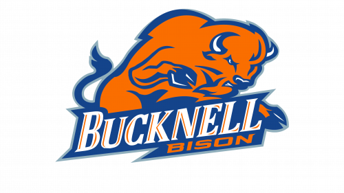
In 2002, the Bucknell Bison logo was updated to a more traditional, detailed design that conveyed a greater sense of power and determination. The redesigned bison in the new logo was depicted in solid orange, outlined in blue, with delicate white accents on the horns, eyes, and hooves, adding depth and realism. The animal’s tail was entirely blue, contributing to the logo's cohesive color scheme.
The updated logo also included a wordmark, a key departure from the previous version. The wordmark consists of two lines of text placed slightly diagonally beneath the bison. The top line features the word "Bucknell" in white, capitalized letters with small triangular serifs and thin orange lines over the letters, giving it an elegant and custom feel. The bottom line contains the word "Bison" in smaller, extended font, colored in orange, set against a solid blue background, creating contrast and balance within the design.
The updated logo reflected the university’s desire for a more detailed, powerful representation of its mascot, while also incorporating a stronger, more cohesive visual identity with the addition of the wordmark. The design evoked a sense of strength, determination, and readiness to compete, aligning with the university's competitive spirit and commitment to excellence in athletics.
| File | Action |
|---|---|
| Bucknell Bison Logo.png | Download |


