- Version
- Download 74
- File Size 106.43 KB
- File Count 1
- Create Date December 13, 2024
- Last Updated December 13, 2024
The Teenage Mutant Ninja Turtles (TMNT) franchise, born from a comic book series in 1984, quickly grew into a cultural phenomenon, spawning cartoons, movies, toys, and video games. The franchise’s logo has evolved over the years, adapting to each new iteration of the brand while retaining iconic elements that connect it to its origins.
Logo Evolution and Meaning
The Teenage Mutant Ninja Turtles logo reflects the evolution of the franchise, from its humble comic book beginnings to its status as a global pop culture icon. The logo has undergone several redesigns, each representing the changing tastes and aesthetics of its time, while keeping the essence of the turtles' crime-fighting identity intact.
1987–1996
The original logo, introduced in 1987 for the animated series, featured a bold and cartoonish design. The word "TURTLES" was written in uppercase letters with a playful, stylized font resembling a turtle shell pattern. It was arched above a red banner with the words "Teenage Mutant Ninja" in a white, bold, geometric sans-serif font. This first version remained largely unchanged for nearly a decade, becoming instantly recognizable to fans.
2003–2006
In 2003, the logo was redesigned to reflect a more modern and dynamic look. The red banner turned black, and the text became more three-dimensional with gradient coloring, transitioning from red to yellow. The "TURTLES" lettering was also redesigned, now featuring elongated, pointed ends with green gradients and white and black outlines. This new version of the logo aimed for a sharper, more mature look, catering to an updated audience.
2006–2008
This redesign preserved the 2003 logo but added a blue ribbon beneath the wordmark. The ribbon, outlined in black, gave the design a sense of speed and motion, echoing the energy of the turtles. The phrase "Fast Forward" was included in bold white lettering, emphasizing the futuristic feel of the new series.
2008–2009
The 2008 logo took a more brutal and modern approach. The "TMNT" abbreviation was the focal point, rendered in a bright gradient green with geometric, sans-serif lettering. A flat green "Back to the Sewer" tagline was added beneath it, executed in a cartoonish, handwritten font. The overall design was bold and aggressive, marking a new direction for the franchise.
2010–2015
In 2010, the logo used for the 2003 animated series returned with one important addition: the bold, lowercase "Nickelodeon" logo was placed above the TMNT logo. This change was a result of Nickelodeon acquiring the franchise in 2009. The Nickelodeon logo was placed above the turtles’ emblem for the next five years.
2012–2017
Between 2012 and 2017, the franchise adopted a new geometric design with a brown-yellowish green "Turtles" wordmark. The letters were stylized in a square, sans-serif font, and the words "Teenage Mutant Ninja" were placed underneath. The design featured fragmented letters, where parts of the black lettering were erased, giving it a fresh, edgy, and progressive look.
2018–2020
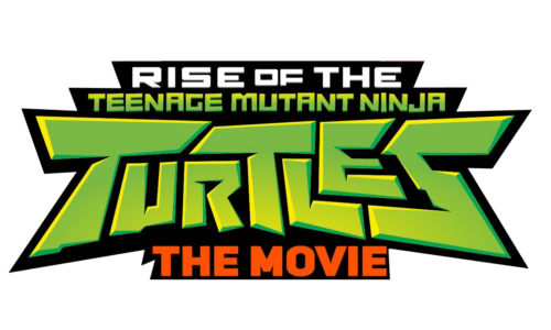
In 2018, the logo was adapted for another animated series season, with smooth green gradients transitioning from light to medium shades. The upper part of the logo included the phrase "Rise of the" in bold white letters against a black geometric banner. This update reflected a fresh direction for the turtles, with a focus on youthfulness and energy.
2022–Present
The 2022 logo was designed for the release of the Teenage Mutant Ninja Turtles: The Movie. The updated logo kept the bold and energetic look but added the tagline “The Movie,” placed in either white or red, depending on placement. The color palette was brightened to create a more vivid and exciting tone, marking the evolution of the turtles' image as both timeless and contemporary.
Original Emblem
The origins of the Teenage Mutant Ninja Turtles logo are rather humble. It started as a joke between co-creators Kevin Eastman and Peter Laird. Eastman sketched a turtle holding nunchaku, and Laird added more turtles with different weapons. From there, the characters evolved, with Eastman adding the name "Ninja Turtle" and Laird changing it to "Teenage Mutant Ninja Turtle."
1987 Cartoon Logo
The 1987 cartoon logo retained many elements of the original design, with the “Teenage Mutant Ninja” words in uppercase white letters on a red banner. The word “TURTLES” was arched below in green, with a playful, turtle-patterned font that was thick and distressed, capturing the whimsical and action-packed nature of the series.
Font
The fonts used in the TMNT logos have ranged from bold sans-serif to playful, cartoonish styles. Throughout the different designs, the logo has maintained a youthful and energetic feel, while occasionally evolving to reflect a more modern and sharp look as the brand matured over the years.
| File | Action |
|---|---|
| Ninja Turtles Logo.png | Download |


