- Version
- Download 165
- File Size 105.42 KB
- File Count 2
- Create Date December 12, 2024
- Last Updated December 12, 2024
The Dallas Mavericks' logo history dates back to 1980, when the basketball team was founded in 1978 by Californian businessman Garn Eckardt and Don Carter, the owner of Home Interiors and Gifts. While the Mavericks' visual identity hasn't undergone many dramatic changes over the years, each version of the logo has contributed to building the team's modern and professional image.
1980 – 1993
The original Mavericks logo, introduced in 1980, was centered around a bold and dynamic design. The emblem consisted of a solid green basketball with a blue, italicized "M" in a thin white outline, topped with a white cowboy hat. This was placed to the left of the team’s wordmark, which featured a fancy serif typeface. The lettering was all in capital letters, with elongated and curved lines, and the wordmark had blue as its primary color, with green and white outlines surrounding it. The combination of blue and green was designed to evoke energy and movement, fitting for a basketball team.
1993 – 2001
In 1993, the Mavericks redesigned their logo with only subtle tweaks to the emblem and wordmark. The "M" was slightly modified to give it a more sleek and elegant appearance, while the typeface of the wordmark was updated to a cleaner, more confident serif style. The new typeface was more straightforward, with classic lines and cuts, and the color was now a solid blue without outlines or additional accents. This redesign represented a more refined and professional look for the team.
2001 – 2017
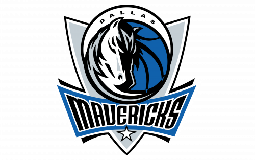
In 2001, the Mavericks unveiled a more modern and memorable logo, shifting toward a sleeker and more stylized design. The emblem now featured a blue basketball with black lines and the head of a horse, executed in a gray and white color palette. This was placed on a shield-like background, with the word "Mavericks" written across a blue banner below the emblem. The design also included a five-pointed star under the wordmark, symbolizing Texas—the “Lone Star State.” This redesign was bold and contemporary, with a more aggressive and memorable identity.
2017 – Present
The logo received a further update in 2017, when the color palette was deepened by darkening the shades of blue and gray. These changes added a more progressive and professional feel to the logo, further modernizing the Mavericks’ visual identity. The new color tones give the logo a sleeker, more polished look while maintaining its iconic design.
Font
The word "Mavericks" in the logo uses a modified version of the TF Cavalier Upright Bold font. The word "Dallas," however, is written in a simpler sans-serif font, giving a clean and contemporary look to the logo.
Colors
The official color palette for the Mavericks features two shades of blue: royal blue and navy blue, as well as silver and black. White is also used as an accent color to add clarity and balance to the overall design.
- Royal Blue: #00538C (PMS 2388 C)
- Navy Blue: #002B5E (PMS 289 C)
- Silver: #B8C4CA (PMS 877 C)
- Black: #000000 (PMS BLACK 6 C)
The Dallas Mavericks logo has undergone a relatively minimal number of redesigns, but each has played a role in strengthening the team's identity, evolving from a playful and energetic emblem to a sleek, professional symbol that reflects the Mavericks' growth and success.


