- Version
- Download 111
- File Size 25.45 KB
- File Count 1
- Create Date December 12, 2024
- Last Updated December 12, 2024
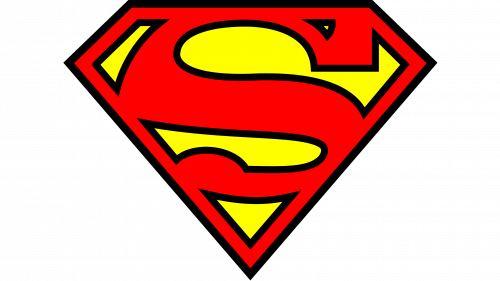
The Superman logo, with its iconic "S" inside a shield, has undergone over 25 changes in its 75-year history. While these alterations have mostly been stylistic, the fundamental visual metaphor—the "S" within a shield—has remained intact, becoming one of the most recognized symbols in popular culture.
The Superman story began long before the emblem we recognize today. In 1933, Jerry Siegel and Joe Shuster, teenagers at the time, created a character that would eventually revolutionize the world of comics. Initially, their early works included a science-fiction strip titled The Reign of the Superman, where the prototype of the iconic hero appeared. It wasn't until 1938 that Superman debuted in Action Comics #1, fully formed as a positive, heroic figure with a backstory, alter ego as a journalist, and the iconic costume.
Superman’s shield logo, introduced in 1938, has undergone numerous design tweaks, but its essence has always remained true to the original concept—a bold "S" inside a pentagonal or shield-like shape. The first version had a yellow background with a red "S," outlined in black.
1938–1939
The earliest Superman logo featured a yellow shield with a red "S." This version was simple yet powerful, and it evolved quickly in the same year, with the shield shape transforming into an inverted triangle and the "S" becoming larger and more stylized.
1939–1940
In the first Superman film, the logo saw further refinement, with a sleeker "S" and a more angular shield shape. It wasn’t until 1940 that the triangular shape we now associate with Superman became permanent. The "S" also became emboldened and more geometric.
1940s
The 1940s saw subtle changes, including color shifts and adjustments to the proportions of the "S" within the shield. In 1941, the diamond-shaped shield made its debut, which became the definitive shape for the emblem.
1950s–1960s
By the mid-20th century, the design began to modernize. The "S" was refined, giving it sharper lines and a more contemporary feel. By 1968, the black outline was introduced, giving the logo a more defined and bold presence.
1980s–1990s
During this period, the logo saw several iterations, mainly focusing on cleaner lines and brighter color palettes. The red and yellow color scheme remained, but the "S" continued to evolve. The most significant change came in 1997 with a more futuristic redesign in the Electric Blue Superman storyline, where the logo was altered to blue and white. However, this design was short-lived, and the traditional red-and-yellow shield returned in later years.
2000s–2010s
The 2000s saw the return of the classic yellow-and-red color palette, with the emblem becoming more streamlined and the "S" more angular. In the 2016 Batman v Superman: Dawn of Justice movie, the logo was altered once again, with the "S" placed over Batman's bat symbol, marking a significant crossover moment in the superhero world.
While the "S" in the Superman logo most obviously represents the first letter of Superman’s name, it has additional meanings. Some interpretations suggest it is a Kryptonian symbol for "hope," others believe it is a family crest worn by Superman’s father, Jor-El. It has also been tied to healing and strength, with some theories linking it to Native American symbols representing a snake.
The "S" itself was custom-designed and has been slightly altered in each iteration. Its original form, seen in Action Comics #1, was quite simple, but over time it became more distinctive with each redesign. In the Adventures of Superman TV series in the 1950s, the "S" was refined, giving it the sharp, angular appearance we now associate with the hero.
The color scheme of the Superman logo, traditionally a bold red and yellow, has seen slight variations over the years. The red symbolizes strength, power, and the sun (especially in relation to Superman’s Kryptonian origins), while yellow represents hope and the solar energy that fuels Superman’s powers. Some versions of the logo featured brighter or more electric shades of red and yellow, while others took on more muted tones. In the 1990s, some versions of the logo had a slightly paler appearance, particularly during Superman’s "Electric Blue" storyline.
| File | Action |
|---|---|
| Superman logo.png | Download |


