- Version
- Download 123
- File Size 40.36 KB
- File Count 1
- Create Date December 10, 2024
- Last Updated December 10, 2024
Spider-Man is one of the most enduring and beloved superheroes in comic book history. His iconic look and logo have evolved in tandem with the character, reflecting his growth from a humble teenager into a hero known worldwide. Created by Marvel Comics in the early 1960s by Stan Lee and Steve Ditko, Spider-Man first appeared in Amazing Fantasy #15 in August 1962, quickly becoming a cultural phenomenon. His character was defined by his relatability as a young, struggling teen—Peter Parker—who, after being bitten by a radioactive spider, gained powers that allowed him to swing across New York City, climb walls, and shoot webs. This mix of power and responsibility became central to Spider-Man's identity, symbolizing the everyday struggles faced by many of his fans.
Logo History:
- 1963 – Today (Original Logo): The first Spider-Man logo consisted of a simple wordmark, written as "Spider-Man" in capital letters using a soft sans-serif font. The color scheme was yellow with red undersides, which created a perspective effect where the underside of the letters appeared in a different shade.
- 1976 – 1987: The 1976 redesign saw the logo shift to more linear, wider shapes. The curve of the letters was reversed, and the color scheme was altered to white letters with red undersides, giving the logo a more modern look.
- 1985 – 1988: This iteration of the logo was a stricter, more 3D design. The wordmark was viewed from above, with a more linear and taller font. The colors shifted to red with yellow accents, giving the logo a bold and dynamic appearance.
- 1994 – 2005: The 1994 version of the logo was used for Spider-Man: The Animated Series. The wordmark became more aggressive and angular, with the letters appearing taller and jagged. Red outlines surrounded the white letters, contributing to a sharper, more energetic look.
- 1996 – 2005: This version kept the same structure but switched to a cleaner, more modern color scheme of white and red. The gothic, sharp style of the previous logo was toned down, creating a more readable, streamlined version of the logo.
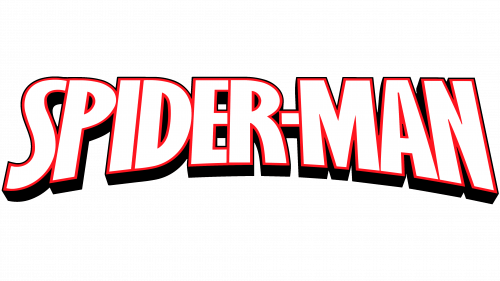
- 2016 – 2018: The 2016 redesign introduced a geometric and stable style with a smooth, energetic feel. The wordmark featured white letters outlined in red with a heavy black shadow. The rounded corners and smooth square shapes of the letters added a dynamic touch to the design, evoking movement and power.
- 2005 – Today: This version of the Spider-Man logo incorporates a classic look with updated aesthetics. The symbol of the spider and web typically remains black, with a red background, maintaining the iconic color combination that has become synonymous with Spider-Man. Notably, this emblem has been the most consistent and recognizable version of the Spider-Man logo.
Font and Colors:
The Spider-Man logo uses angular, dynamic lettering that reflects the character’s agility and speed. Although the exact font used in the logo is not publicly available, similar fonts can be found that capture the same energetic, bold style. The color scheme of the logo traditionally includes a red background, with the spider and web depicted in black. Some variations, such as those in 1984 and 1994, feature a white spider on a black background, or even a blue background.
Alternative Logos:
- 1992 Design (Rick Leonardi): A unique version of the Spider-Man costume introduced in 1992 featured a skull-shaped spider body, worn by the first Hispanic Spider-Man.
- Ultimate II (2011): This version of Spider-Man's logo was created by Sara Pichelli, showcasing a red spider on a black background, which became iconic within the Ultimate Spider-Man universe.
How to Draw the Spider-Man Logo:
To draw the Spider-Man logo, you can sketch a round, eight-legged spider with claw-like legs, set against a web background. The spider’s legs should be angular, emphasizing Spider-Man's agility and dynamic movement. A variety of royalty-free illustrations and vectors are available online for reference and inspiration.
Spider-Man’s Legacy:
Spider-Man's logo and character have been immortalized in comics, television series, and movies. He represents more than just a superhero; he is a symbol of responsibility, perseverance, and personal growth, resonating deeply with fans around the world. His evolution in terms of visual identity, from simple wordmarks to intricate and dynamic logos, mirrors the changes in the character’s journey from a young man learning to navigate his powers to a global hero.
| File | Action |
|---|---|
| Spiderman Logo.png | Download |


