- Version
- Download 54
- File Size 25.66 KB
- File Count 1
- Create Date December 10, 2024
- Last Updated December 10, 2024
Lens, officially known as Racing Club de Lens and affectionately called "Sang et Or" (Blood and Gold), is a French football club with a rich history. Established in 1906, the club proudly represents the mining heritage of its region. The team plays in Ligue 2, with Franck Haise currently serving as head coach.
The Story Behind the Lens Logo
The club’s identity has remained steadfast over the years, reflected in its visual branding. The red, yellow, and black colors of the Lens logo symbolize the "blood and gold" of the mining industry that shaped the region’s history. The miner’s lamp, prominently featured in all iterations of the emblem, serves as a tribute to the club's roots and its community’s legacy.
Evolution of the Lens Logo
1955 – 1968
The first Lens crest was bold and striking, featuring a dark shield with a miner's lamp at its center, outlined in red with a yellow banner bearing the initials "RCL" in red sans-serif letters. The lamp's six radiant beams added a sense of dynamism, symbolizing strength and pride in the region's heritage.
1968 – 1979
The design was modernized, with the shield split diagonally into orange and yellow halves. The miner's lamp remained on one side, while the "RCL" monogram was placed on the other. A white and black outline added definition, giving the logo a more contemporary feel.
1979 – 2001
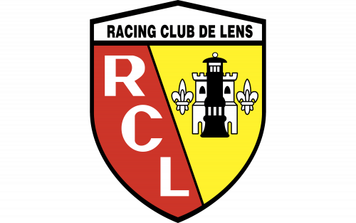
In this update, the shield adopted a red-and-yellow color scheme to enhance its boldness. The miner’s lamp was placed atop a white castle tower, flanked by two fleur-de-lys symbols, tying the club's identity to its region’s heraldry. A white ribbon on the crest's top bore the words “Racing Club de Lens”, enhancing the badge’s sophistication.
2001 – 2014
The logo underwent refinement, modernizing the castle tower and fleur-de-lys while enhancing the "RCL" lettering with a sleek typeface. The club added "Depuis 1906" above the name ribbon, emphasizing its rich history.
2014 – Present
The most recent redesign retained the familiar elements, with cleaner contours and bolder "RCL" letters. The updated look strikes a balance between modernity and tradition, preserving its connection to the club’s origins.
Colors
The Lens color palette reflects the club’s nickname, Sang et Or:
- Red (Pantone PMS 485 C): Representing blood, symbolizing passion and vitality.
- Yellow: Representing gold, reflecting the wealth of the mining region.
- Black: Added for contrast, symbolizing strength and unity.
Lens: More Than a Club
Racing Club de Lens is a testament to the enduring power of community and history. Its logo and colors proudly honor the legacy of a region built on hard work and resilience, making it a symbol of pride for its fans.
| File | Action |
|---|---|
| Lens Logo.png | Download |


